Evil Dead Rise Necronomicon

jcporcel

Active Member
I've recently finished replicating the Evil Dead Necronomicon pages from the classic movies over here, so I finally decided to face my fears, gather courage and start replicating the pages from Evil Dead Rise, which are a billion times more detailed and complicated than any other Necronomicon on the franchise.

As usual, I simply re-trace all the illustrations, that way I get perfect transparent files at any resolution I need. Its also a fantastic inking practice and I can do it while watching movies so win win.

I also try to make my props on the cheap so the simple monochrome pages are very easy printed or make photocopies so I can age the paper later.

Here is a bit of my process (I assemble the references in photoshop and then ink everything on Procreate):

I've started by making pages based on the very nice photos of the sound track disk:
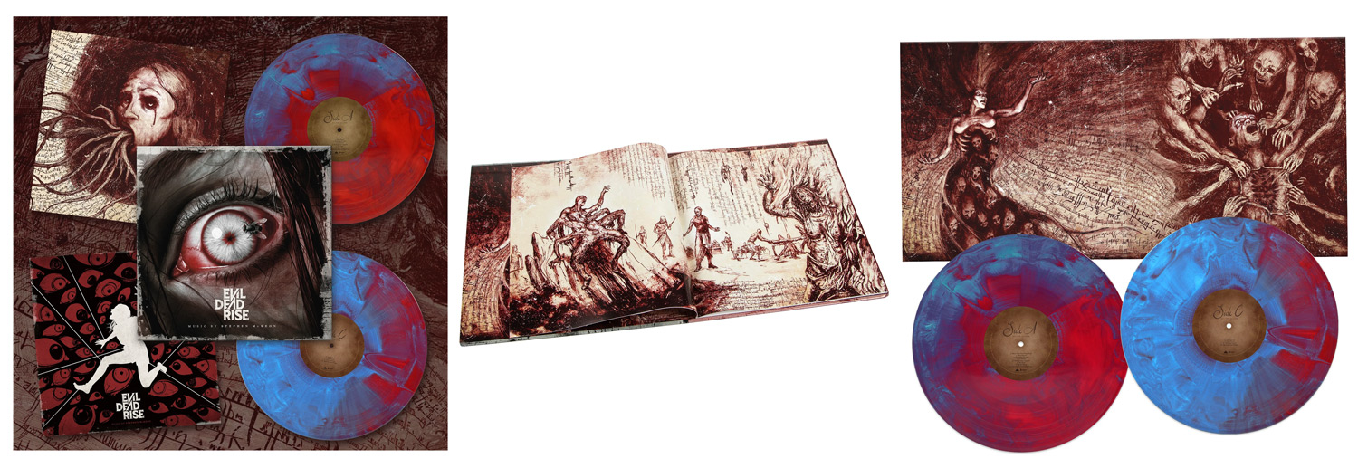
RPF.jpg


Here is an example of the finished version:
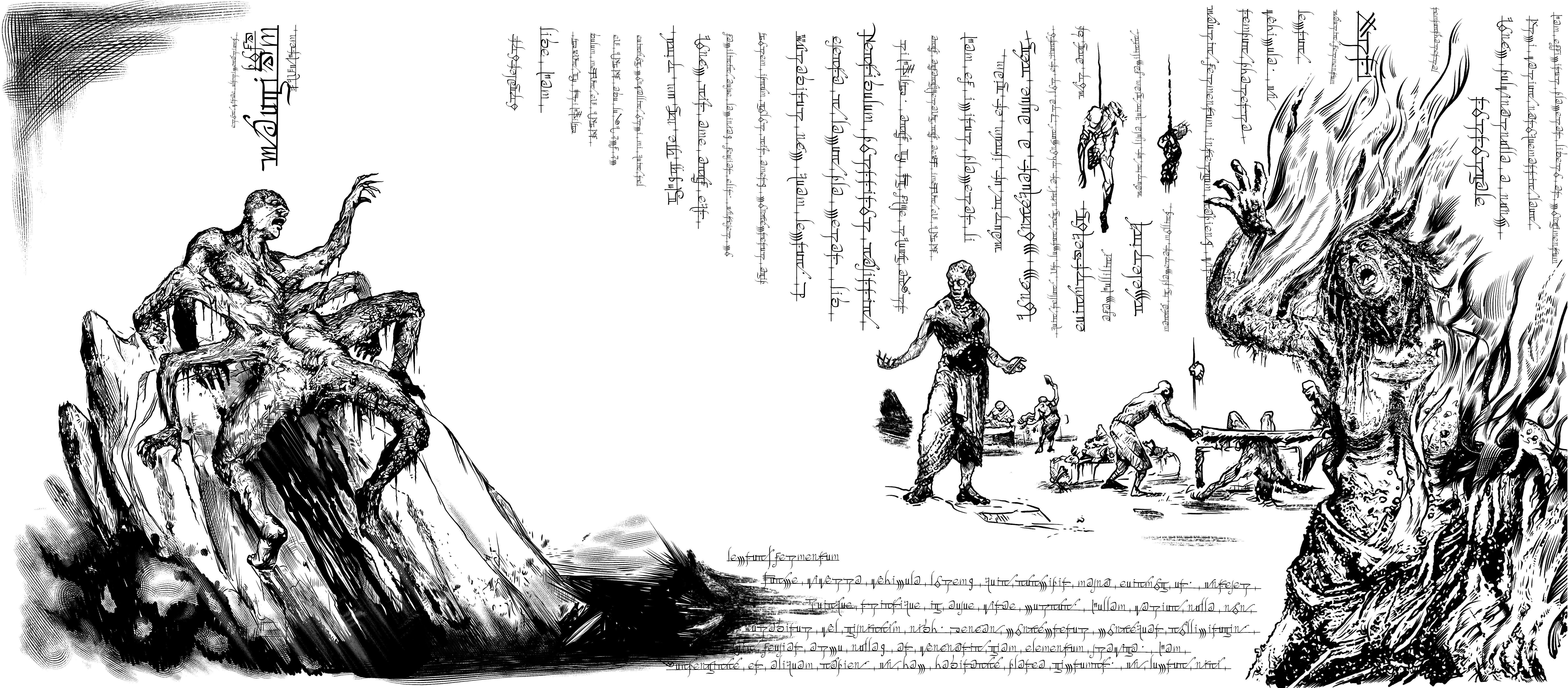
RPF.jpg


I've been uploading the full-res files to google photos for now over here: www.elderprops.com - Evil Dead Rise
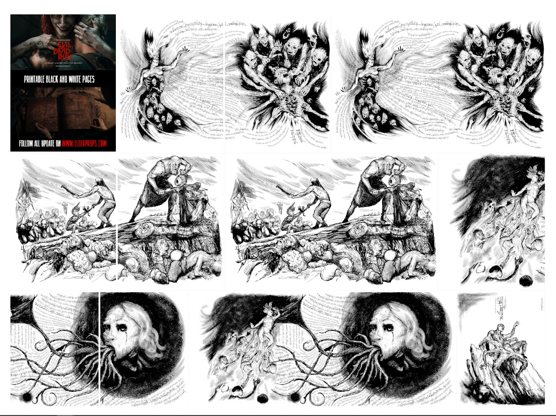
preview.jpg

And since Halloween it's coming, it's still time to start building a new Necronomicon!
I´m still missing a couple pages from the disk, so I´ll be posting them over here as soon as I upload them.
 
Regarding the text on the pages, I very quickly decided that trying to re-trace all the text would be impossible, it's just too much.

I’m also not very focused on perfect screen accuracy so all my props are very loose approximations, as long as it looks cool, I'm fine with it. So with that in mind, I made a font file that could look believable enough if you didn't have the real pages side by side to compare. I used the credit screens as reference since there was quite a lot of very clear text to reference. Like this one:
text-ref.jpg


Once I had the font file, I used illustrator to write in random directions and use any shape of line to add text. Even with this adding all the lines took quite a bit of time but the result is very believable. Here a couple of examples with a bit of color and texture:
smaple-page-1.jpg
smaple-page-3.jpg


If anyone wants to make additional pages, I’ve put together a download for a few dollars with the font and an illustrator file as an example over here: Rising Script, A Evil Dead Rise Font
cover.jpg

Example illustrator file looks like this:
illustrator-example.jpg
 
This is pretty damned cool! U always wanted a replica of the one from the 2013 movie but never saw a replica for sale that I liked. Did you ever attempt that one? Current WIP looks great!
 
This is pretty damned cool! U always wanted a replica of the one from the 2013 movie but never saw a replica for sale that I liked. Did you ever attempt that one? Current WIP looks great!
I think the second ever replica I tried to make was the 2013 necro. Now that I look at the pages, I really want to remake them, at least the text. I might make a new font file now that I've had a bit more practice.
The illustrations are ok though: Necronomicon (Evil Dead 2013) | The Elder Props
I used goat skin to make the cover and it was a good starting point but it needed a lot more paint to look like the one in the movie. I would retouch it now but I sold it so I should probably make a new one once I retouch the page files.
The cover design on that necro is very cool and simple to make compared to the other ones with faces.
 
I've finished uploading all these pages to google photos so the folder should be up to date.

I've also finished organizing all the other pages based on screenshots from the movie and put together another version with that. Both versions can be downloaded over here: Evil Dead Rise Necronomicon | The Elder Props
ed-rise-previews-book.jpg


And optionally, there are also available all the illustrations as single transparent PNGs in case you want to use them to make additional pages.
ed-rise-previews-prop-maker.jpg


cover.jpg
 
Great work! I didn't think anyone would try this book because it's so complex.
I've just used your 2013 font and a couple of pages for my interpretaion of that one, so thanks for that.
 
Bonjour à tous.
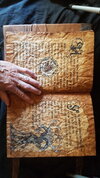
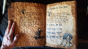
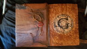
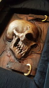
Voici un tout petit bout de mes créations en cuir, bois, métal et papier
 

Attachments

  • 20220528_111311 - Copie.jpg
    20220528_111311 - Copie.jpg
    1.6 MB · Views: 199
  • 20220528_111253.jpg
    20220528_111253.jpg
    3.6 MB · Views: 228
  • 20220528_111253 - Copie.jpg
    20220528_111253 - Copie.jpg
    3.6 MB · Views: 206
  • 20220528_111215 - Copie.jpg
    20220528_111215 - Copie.jpg
    3.2 MB · Views: 185
  • 20220528_111011.jpg
    20220528_111011.jpg
    1.5 MB · Views: 231
Great work, I really liked the film and I would like to redo the Necronomicon. I really like the rendering, but for the pages of the 2013 Necronomicon there were colors and inscriptions it seems to me is this normal? Thank you
 
Hello everyone, I'm trying to redo the 2013 necronomicon for myself, I started to put the pages in the right order, before noticing that the left page is the same on both images but the right page changes??? and what the book changes in a "magic" way these illustrations? which would mean that recreate a book with the right number of pages in the right order and impossible?? thank you :)


22 et 23.png
pages 3.png
 
Here is my first plan of the pages of Naturom Demonto 2013, after several searches between the film and the other reference images, with certain inscriptions made with the pen that we can see through the "relief" pages I was able to deduce that these pages were more or less in this order, there are pages where I am sure of their location in the book. If you have suggestions for modifications, the goal is to be able to create a FREE file of these different exchange and sharing of information. ;)
LIEN : Dropbox
 
Back
Top