MR-style Plaque Stand STL file?

Probably forgot to mention, but the stand files are free-use for anybody that wants to print some. If the V3 checks out, I'll add other plaque sizes; just need the plaque's actual dimensions and orientation (tall vs. wide)
 
Probably forgot to mention, but the stand files are free-use for anybody that wants to print some. If the V3 checks out, I'll add other plaque sizes; just need the plaque's actual dimensions and orientation (tall vs. wide)
This is so exciting! I'm away from home right now, but will be home later tonight. I can't wait to print one!

Thank you for your quick work!!!
 
We have to adjust the height again, sorry. It's a touch too tight. It fits, but it's a snag fit, which is not so good. The custom plaques in particular are always a little thinner and have sharper edges in terms of material, they don't fit well. Please go a touch higher here.

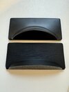
I also have a suggestion for a better look and feel. The "stand" on the back is currently very "sharp-edged" compared to the original. If you could design it a little "softer/rounder" that would be great. Comparison attached. Maybe leave a little more space on the right and left to the edge like the original. Top is original down is V3.

Thanks in advance!
 

Attachments

  • 24-09-30 17-48-59 9827.jpg
    24-09-30 17-48-59 9827.jpg
    1.1 MB · Views: 47
These are so awesome! I've already printed about a dozen! (by my count, I need about 30 for all of the props I want to use them with).

Since I have no real nor custom plaques, I've made up my own "MR-Inspired" version and have been printing them on gloss photo paper. They don't look too shabby.

luke esb plaque.jpg


I've created a template for both photoshop and GIMP, and have attached it here if anyone wants to use it. Basically, you just edit the episode title, character name, and prop name. There's another line for prop version (IE Shared stunt, Hero Version 2, etc) that I didn't use for the plaque in the photo.
I've included layers with different emblems/symbols for the lower-right corner including rebellion, empire, sith empire, dark lord of the sith, jedi order, galactic republic, first order, etc. Just enable the layer for the one you want and disable the rest. Of course you could add your own as well. Feel free to use it for non-commercial purposes!

You'll need the EB Garamond font in order to edit them.
 

Attachments

  • MR style Star Wars plaque templates.zip
    4.9 MB · Views: 21
These are so awesome! I've already printed about a dozen! (by my count, I need about 30 for all of the props I want to use them with).

Since I have no real nor custom plaques, I've made up my own "MR-Inspired" version and have been printing them on gloss photo paper. They don't look too shabby.

View attachment 1865507

I've created a template for both photoshop and GIMP, and have attached it here if anyone wants to use it. Basically, you just edit the episode title, character name, and prop name. There's another line for prop version (IE Shared stunt, Hero Version 2, etc) that I didn't use for the plaque in the photo.
I've included layers with different emblems/symbols for the lower-right corner including rebellion, empire, sith empire, dark lord of the sith, jedi order, galactic republic, first order, etc. Just enable the layer for the one you want and disable the rest. Of course you could add your own as well. Feel free to use it for non-commercial purposes!

You'll need the EB Garamond font in order to edit them.
I forgot to mention - while the EB Garamond font seems to be the closest to what MR used, the numbers are strange and smaller than the other characters... so I just change any digits to "Times New Roman" and it seems to match close enough.
 
...A bit off topic, but to make your template even more authentic, "Trajan" is the official font for the name of the episode and the prop (ex. Luke Skywalker, Lightsaber etc.).

"Garamond" is used only at the very bottom for "Limited Edition" because Trajan doesn't have lowercase letters. This was already mentioned/confirmed by MR/EFX here in the forum a long time ago. Help with Master Replica Plaque Font

Regards
Thanks!!!
 
We have to adjust the height again, sorry. It's a touch too tight. It fits, but it's a snag fit, which is not so good. The custom plaques in particular are always a little thinner and have sharper edges in terms of material, they don't fit well. Please go a touch higher here.

I also have a suggestion for a better look and feel. The "stand" on the back is currently very "sharp-edged" compared to the original. If you could design it a little "softer/rounder" that would be great. Comparison attached. Maybe leave a little more space on the right and left to the edge like the original. Top is original down is V3.

Thanks in advance!
laellee , have you had a chance to do a little update? Thanks in advance!
 
Back
Top