Un Chakal
Active Member
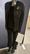
I've seen other makers do a button. I think a magnet inside would be great and futuristic.Is there going to be something keeping the bottom jacket flap closed? A magnet or button? I hadn’t noticed anything.
This forum is intended for interest gauging and active runs. Due to the transient nature of this forum, please keep all research and ongoing discussion in one of our main forums so your information is not lost.
Only Premium Members can start a new run.
I've seen other makers do a button. I think a magnet inside would be great and futuristic.Is there going to be something keeping the bottom jacket flap closed? A magnet or button? I hadn’t noticed anything.

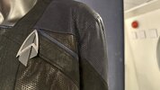
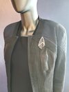
Will the red on the final be more maroon / darked and earthy as seen in the show?I didn't decreased neck size, just slightly curved straps.
View attachment 1695375
Our mock-up based on M size jacket, you can see their jackets neck close to neckline.
View attachment 1695378
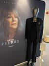
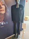
What pantone blue are you usingHey all,
a small updates about burgundy and blue leather color refrence.
View attachment 1701822View attachment 1701823View attachment 1701824
Pantone 532c.What pantone blue are you using
Very deep blue but looks correct. Lots of people mentioned they couldn't determine it was blue/black so that tracks as correctPantone 532c.
Obviously a dozen factors in seeing them between lighting and cameras and screens but looks damn good to me after seeing them in person. Sorry I didn’t have color swatches at the museum lol.Hey all,
a small updates about burgundy and blue leather color refrence.
View attachment 1701822View attachment 1701823View attachment 1701824
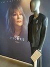
My best reference again. It’s not up to me but I’m gonna buy that. LolHey all,
a small updates about burgundy and blue leather color refrence.
View attachment 1701822View attachment 1701823View attachment 1701824
These were some of the primary references I used in choosing the color for the blue.My best reference again. It’s not up to me but I’m gonna buy that. Lol
I appreciate it. Glad to help. Those jackets hadn’t even been on screen yet when we were at the first museum display on the Star Trek Cruise. So amazing. But I vividly remember needing so much light to see the blue. I think that may have even been taken with a flash. I’m excited you are attending to this project with such detail.These were some of the primary references I used in choosing the color for the blue.
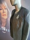
Hey all, another set of marina photos. Take. In bright early morning sun at the museum display. The blue is really that dark. Just sayin. A dark inky gray almost.Hey all,
a small updates about burgundy and blue leather color refrence.
View attachment 1701822View attachment 1701823View attachment 1701824
Sounds good to me!Still finalizing design details, but it's very unlikely anything perforated will be unsupported. So either another layer of leather or cloth beneath it for added strength.
Hey all, another set of marina photos. Take. In bright early morning sun at the museum display. The blue is really that dark. Just sayin. A dark inky gray almost.