A custom piece of furniture has been quoted for the new 3D printing workbench:
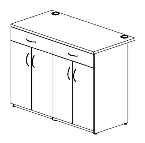
Credenza.jpg

The rear overhang is deliberate and requested - it enables power cords to hang behind the cabinet instead of falling into the drawers and needing to be snaked through the back to a powerstrip. The old workbench was done like this as well. The cabinet's front will align with the front of the desk's return, and the two grommets are going to be omitted - they're charging $100 per grommet and I can do it for $5 and a little bit of time (I've already installed my own grommets on all prior furniture). I've decided on the charcoal top for this, and been considering maybe also extending the adjoining hutch to the ceiling with a curved outside edge to give even more of a Trek look to the room. I'll need to first see how well the paint color matches and if such a divider would interfere with the room's light fixture. Yet again, if you give a moose a muffin......
 
Last edited:
(Are you the same Lt Washburn as at the Starfleet 1701st Uniform Club? My two uniform projects haven't been abandoned, in fact this remodel is going to provide an improved area for me to work on them. I am STILL waiting for my wool elastique to finish getting dyed!)

Yes, that's me. Unless there are two Lt. Washburns hanging around Trek boards. :)
 
I did not get all the painting done this weekend. It's the holidays and thus not as much time for projects as I anticipated. The new gray is significantly darker than the previous gray and does not have any blue tint:
NewGrayPaint.JPG


Yes, that's "Distant Star" on the walls, not white! It's going to take two coats of the satin darker gray to completely cover the semi-gloss lighter gray, but the good news is the new color does match the furniture:
MatchedPaint.JPG


The satin is also not as shiny as the semi-gloss (duh!) and looks much better. However it is going to take a week or two to get "used to" the darker gray.
 
Last edited:
I'm feeling good about the paint. A second coat on all the trim has it uniformly one color. Looking back at the older photos (first couple posts) the "Distant Star" looked much darker in the evening photos, which is roughly how the new gray looks in normal lighting. Rolling of the broad areas starts tomorrow.
 
Last edited:
An interesting thing happened, which I suspected might - after all the walls are the same color, the new gray ends up not looking so dark after all (shadows are being cast, hence the darker areas - and also it's not quite completely dry yet):
NewWallColor.JPG


A second coat goes on tomorrow, and then I'll be working on turning shelves gray while the walls cure. Caveneau sorry for changing colors on you, but it's more important that the walls match my furniture than that they are similar to "official" colors thousands of miles away. In case anybody might be interested, the new gray's paint mix is:
CustomGray.JPG


The color dot on top of the can looks similar to how I remember "Online" looking (as a Science Officer says, "Interesting") so next time I'm at Lowe's I intend to get another sample card (as well as "Gravity") to see how they compare (I don't have any of the old sample cards anymore).

Smooth-faced closet doors are bought - they were $6 less per door at Home Depot than at Lowe's and are also pre-primed (unlike the Lowe's doors). So not only did I save $12 but also the primer and time spent prepping them for paint. I don't know yet whether I'll be keeping the "Top Tomato" color or switching to something else - I'll need to see that color next to the new gray after paint has dried.
 
Last edited:
I love watching your progress! Have you considered just putting a clear flat-coat on your doors to knock back the brightness?
 
I love watching your progress! Have you considered just putting a clear flat-coat on your doors to knock back the brightness?
Thank you! Yes, I had considered just adding a clear coat - for being able to re-use the paint I've already bought. But a quart of clear satin/eggshell will probably cost nearly the same as a quart of color, and when I compare screenshots against a pic of my doors it's evident I've got the hue off. "Top Tomato" looks great and totally could have worked with the lighter gray, but I cannot change the color of the furniture and I could change the color of the walls....and that now has effected a change to the color of the doors. I still think the "Tahoe Blue" will be fine for the main door.
 
Looking at the old closet doors (with their semi-gloss glare!), I think the "Top Tomato" color will be too bright beside the new darker gray:
View attachment 1381595
View attachment 1381597

(But look at how well those two grays compare....)

I need to shop for a new red paint. :(
I think the colors are close enough.... It‘s clearly recognizable as a ”Star Trek” room. My only concern is those shelf brackets
 
I think the colors are close enough.... It‘s clearly recognizable as a ”Star Trek” room. My only concern is those shelf brackets
No need to be concerned about the shelf brackets, their transformation is already underway:
PrimingBrackets.JPG


For the curious, here is how the color-matched custom gray compares against "Gravity" and "Online":
ShadesOfGray.JPG


"Close enough" doesn't cut it for somebody like me and a different red color was selected today for the closet doors. It's not as orange as before but I believe is a good representation of the color seen in screenshots. It's Behr PPU2-16 "Fire Cracker" which looks awful at the Behr website but has the correct look in-person:
FireCracker.JPG

TurboLift2A.jpg


My own cruddy iPhone photo doesn't even do the color justice (same as with the previous red). It's a darker red as seen on the show, but exhibits a slight orange tint with sunlight.

I've been working on a placement layout for silver vertical stripes on the walls. I'm undecided on how many to include - there don't seem to be as many in crew quarters and conference rooms as in the corridors. If I follow a 4' spacing then most of them won't be visible due to bookcases, shelving, etc. This is still a work-in-progress and I'm very open to suggestions:
RoomLayout.jpg

Brown represents desks, gray represents shelving (filament shelves above the 3D printer desk aren't in the drawing yet), and green indicates silver tape locations. Large framed Star Trek posters also aren't in the drawing yet, and they too will influence stripe positioning (don't want to have a picture overlapping the tape). None of these are finalized yet, I merely threw some in at 4' spacing to start getting a feel for the placements. One or two may go onto the walls beside the closet and main doors, but I can't work that out until setting locations for the wall intercom and red alert panel.
 
Last edited:
Nice alternative colour choice. I used the Top Tomato but with a cheaper brand base, Glidden, and I'm pretty pleased with how they turned out. At first I regretted not choosing a semigloss finish but I've settled on the eggshell finish. I find the Top Tomato to be very orange-like in certain lights, however I'm still good with the Top Tomato colour, however I do think you've found a great alternative.
Just grabbed a screenshot and it really does look orange sometimes in both the DVD and remastered versions.
 
Against my darker gray the "Top Tomato" color is much too bright. We've got eggshell finish on all the non-remodeled walls of the house (the original paint when it was built) and it's too "rough" to the touch - I chose satin as a compromising middle-ground, smoother feel but not too shiny. The iPhone doesn't take very good photos and the colors look much better in-person. The "Fire Cracker" color does show a little orange tint in some lighting. A lot of painting to do on the weekend.
 
Last edited:
I’m really enjoying watching your progress. When do you think you’ll complete?
 
I’m really enjoying watching your progress. When do you think you’ll complete?
There is no deadline but the sooner we can start getting things put back into the room, the sooner we'll be able to walk through areas of our house without it feeling like an obstacle course! I think the walls have dried enough that I can put my wife's corner back together but currently I've got a lot of shelves and brackets being painted gray and those REALLY need to dry good before anything is placed onto them, so they're the top priority to give them plenty of cure time. The new closet doors should also start getting paint this weekend, but another high-priority task right now is deciding on the placements for silver tape vertical stripes. Unlike previously (because I forgot!) they need to be applied before furniture and shelves are put in place. To help with this I'm nearly finished drafting a 3D CAD model of the room's layout so I can better visualize how they would look (because I need to take into account cabinet and shelving elevations).

And....another step backwards was determined yesterday. For a few weeks I've been concerned about the new furniture's ability to set against a wall with no gaps. Wall base molding forces furniture to be slightly away from the wall unless accommodating cutouts are made at the lower-back. Having a gap between desktops and walls means the inevitable loss of small items falling there. Another reason for needing furniture against the walls instead of against the base molding is so the furniture fits. That small gap makes the difference between whether the two desks fit along the window wall. All my wife's furniture was modified with lower-back cutouts, but this will not be an option on the new furniture due to its construction. For example, full modesty panels (all the way to the floor) flush with the desk sides. The custom 3D printer workbench has this resolved with the top surface's rear overhang, but I did not account for this when ordering the new desk. So, I will need to remove the wall base behind the new furniture, which must be done carefully to not damage the walls or cause an unsightly gap between the trimmed molding and the furniture sides. Measure twice, cut once! (Even better, figure out that kind of stuff before you paint and lay carpet, dummy!)
 
Last edited:
Frog Tape is typically my go-to masking tape when I want clean sharp lines. That was the result I got along the ceiling (mostly) when painting the "Distant Star" color, but dang it the paint sure crept under the tape during repainting:
FrogTapeResult.JPG


And in just one spot? Nope, that would be too easy. ALL around the wall tops. So a portion of today was spent fixing that up so it now looks like this everywhere:
CeilingCleanup.JPG

(and if it looks that clean at this magnification, then yes by golly it looks perfect from a "normal" distance)

Meanwhile, shelving continues their transformation:
PaintingShelves.JPG


I'm also working on the 3D representation of the room layout for placing the silver tape stripes. If you remember from the photo of my wife's side of the room (post #22), there won't be much point in putting tape over there since it would pretty much all be obstructed anyway. No benefit from adding striping where it's not going to even be seen. The main theming area is mainly on my side of the room anyway, so that's where I'll be focusing on the stripe placements, and any leftover tape might get used on the other side.
 
Last edited:
This is an excellent build and I look forward to reading about your progress each evening.

It sounds like you have the paint lines resolved, but I received a tip from my local Sherwin Williams store to run some clear DAP Kauk Seal Plus along the tape seam. It goes on white, when it turns clear you can paint. It (mostly) kept the paint from getting under the tape.

IMG_2633.jpg
 
Key word there - "mostly". Nice masking job, reminds me of a project I did around the perimeter of my son's room:
Cityscape.JPG


There is no wall texture in the dark blue area (I sanded it away then used a vinyl mask to re-apply texture everywhere there weren't buildings), and all the windows glow in the dark. It looks cool both in the daytime and at nighttime.
 
That’s great looking. My walls were a lot more textured than I wanted. It was hard to get the right amount of DAP where I was using vinyl stencils instead of just tape. Never occurred to me to sand the texture down in those spots!
 
Yep, it was a MESS sanding it all smooth, but it allowed the stencil to lay flat on the wall (unlike the first attempt over texture - which just did not work, couldn't get clean lines at all). Then I sprayed texture over the stencil and it was like magic. The most time-consuming part was placing thousands of windows, one at a time with tweezers.
 
Last edited:
Back
Top