Upcoming ANH Jabba the Hutt scene redesign

Frogfreak

Sr Member
Hey everyone! This is a project I've been working on for a long time, and although it's not finished, (not by a longshot) I think it's time to reveal it to the public for all to see! Unfortunately I don't have much to show at the moment, but here we go. First some comparison pics for good measure.
here's what I've got.

Both of the CGI versions of Jabba the Hutt for that scene:
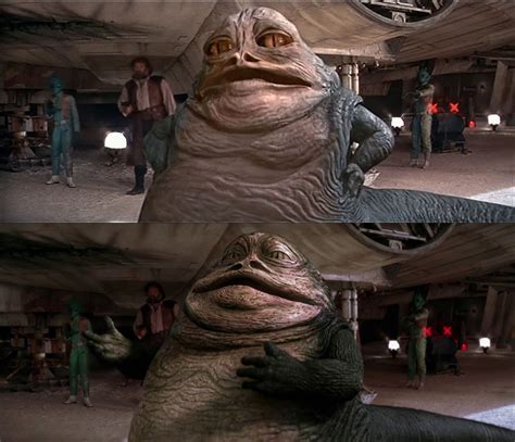
download (1).jpeg


the CGI Jabba for the phantom menace:
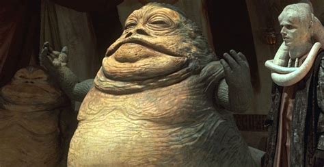
download (2).jpeg


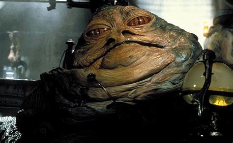
The Original puppet:
download (7)_1.jpeg


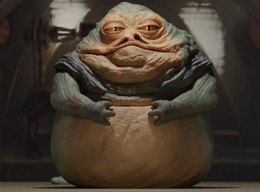
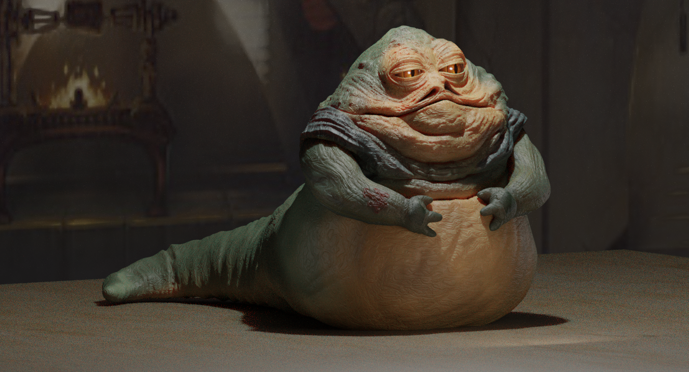
And finally, my model!
jabba 2.0.png
angled model.png


I would love to know your opinions! And absolutely love some constructive criticism!

I should definitely give some credit here, my jabba model is heavily based upon the Jabba the Hutt model made by mightyjabba (I did use some parts with permission) check him out, he's awesome!
 
Last edited:
Wow
Stunning work young man
You have progressed well young padawan

I’m not a designer in anyway, that is something I couldn’t do, all I can say is details are crucial and you need to check details
The left shoulder look higher and more lumpy than the cg drawing
 
Wow
Stunning work young man
You have progressed well young padawan

I’m not a designer in anyway, that is something I couldn’t do, all I can say is details are crucial and you need to check details
The left shoulder look higher and more lumpy than the cg drawing
Thank you! Yeah, it is still a bit of a work in progress, so there are details that are still lacking!
 
Fantastic work, wow!
thank you so much!

CG Geek did exactly this in one of their videos. Model was total **** (sorry), but they got the composite done pretty good in terms of matching colours and stuff. It was far from perfect (clipping and shoddy fat flap simulations), but for a very short project to test some skills it wasn't bad. Looking forward to seeing your take.
Yeah, I saw their video, was not impressed with their model. they also overdid some of the simulations. And it was going a completely different frame rate than the rest of the video. And the amount of times he mentioned he decided not to do something "cause he was lazy" drove me absolutely crazy!

Almighty Sarlacc - this is fantastic!!! And made in Blender! I'm thoroughly impressed!!! GREAT WORK SO FAR!!! Please continue. :)
Thank you kindly!


I appreciate this feedback and support! Thank all of you!
 
I use (- drum roll -) SketchUp! ;)

I tried Blender years ago but it was too difficult for me. I saw that the program was revamped tremendously and will give it another try when I have the time. But for paper modeling SketchUp is good enough. :)
 
I use (- drum roll -) SketchUp! ;)

I tried Blender years ago but it was too difficult for me. I saw that the program was revamped tremendously and will give it another try when I have the time. But for paper modeling SketchUp is good enough. :)
Awesome!
 
The face feels a little too "narrow" to me. His eyes and nostrils should be wider set, and I feel like the eyes should be set further toward the top of the head. It might just be the orientation of the head and the difference in camera lens settings in your rendering software, though. The colors look a little unsaturated, too, but again this might indicate a need for some color correction rather than a problem with your model. The skin could probably use a tad more specularity to get it closer to the look of the RotJ prop. But man, your work totally has the right "feel"! I can't wait to see the results of the animation!
 
The face feels a little too "narrow" to me. His eyes and nostrils should be wider set, and I feel like the eyes should be set further toward the top of the head. It might just be the orientation of the head and the difference in camera lens settings in your rendering software, though. The colors look a little unsaturated, too, but again this might indicate a need for some color correction rather than a problem with your model. The skin could probably use a tad more specularity to get it closer to the look of the RotJ prop. But man, your work totally has the right "feel"! I can't wait to see the results of the animation!
Awesome! I will get to that! Thank for the ideas! That is something I asked about, constructive criticism and ideas!
 
Back
Top