You are using an out of date browser. It may not display this or other websites correctly.
You should upgrade or use an alternative browser.
You should upgrade or use an alternative browser.
Defined Green Lantern Comic Rings
- Thread starter Gregatron
- Start date
Trying to get the scale right is SUCH a maddening hassle. The source material varies SO wildly. In some art, the disc is very much akin to a real-world ring—around 16-20mm, tops. In other art, it’s friggin’ HUGE (along the lines of 23-26mm), and is just as wide (if not wider) than the finger wearing the ring.
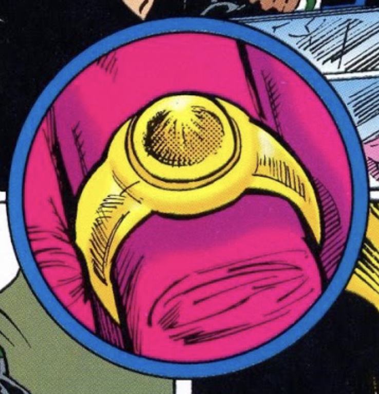
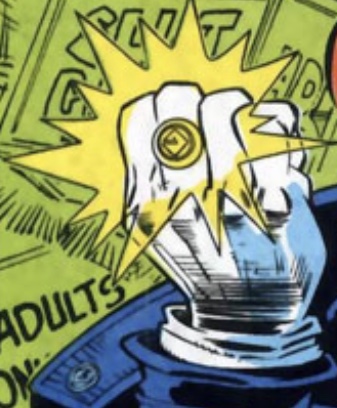
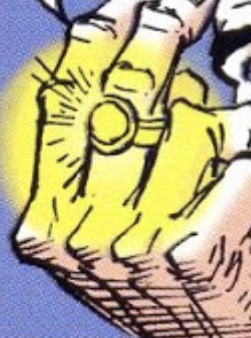
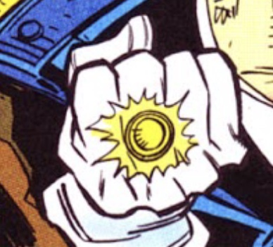
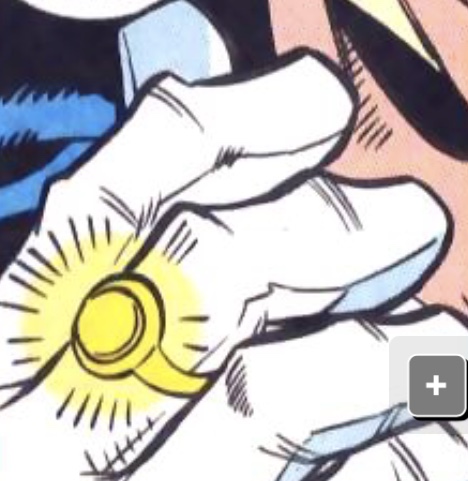
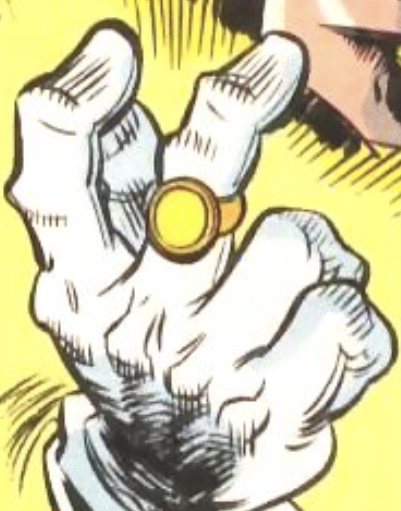
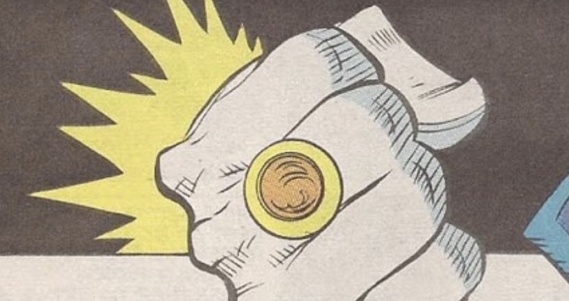
Tinkering with the V3. The only difference here is the height of the face. As noted, the previous iteration still seemed a bit too chunky, and making the face a bit shorter and sleeker might help with that. As usual, there’s a wide range of variance in the comic art.
5mm high on the left, 3.5mm on the right.
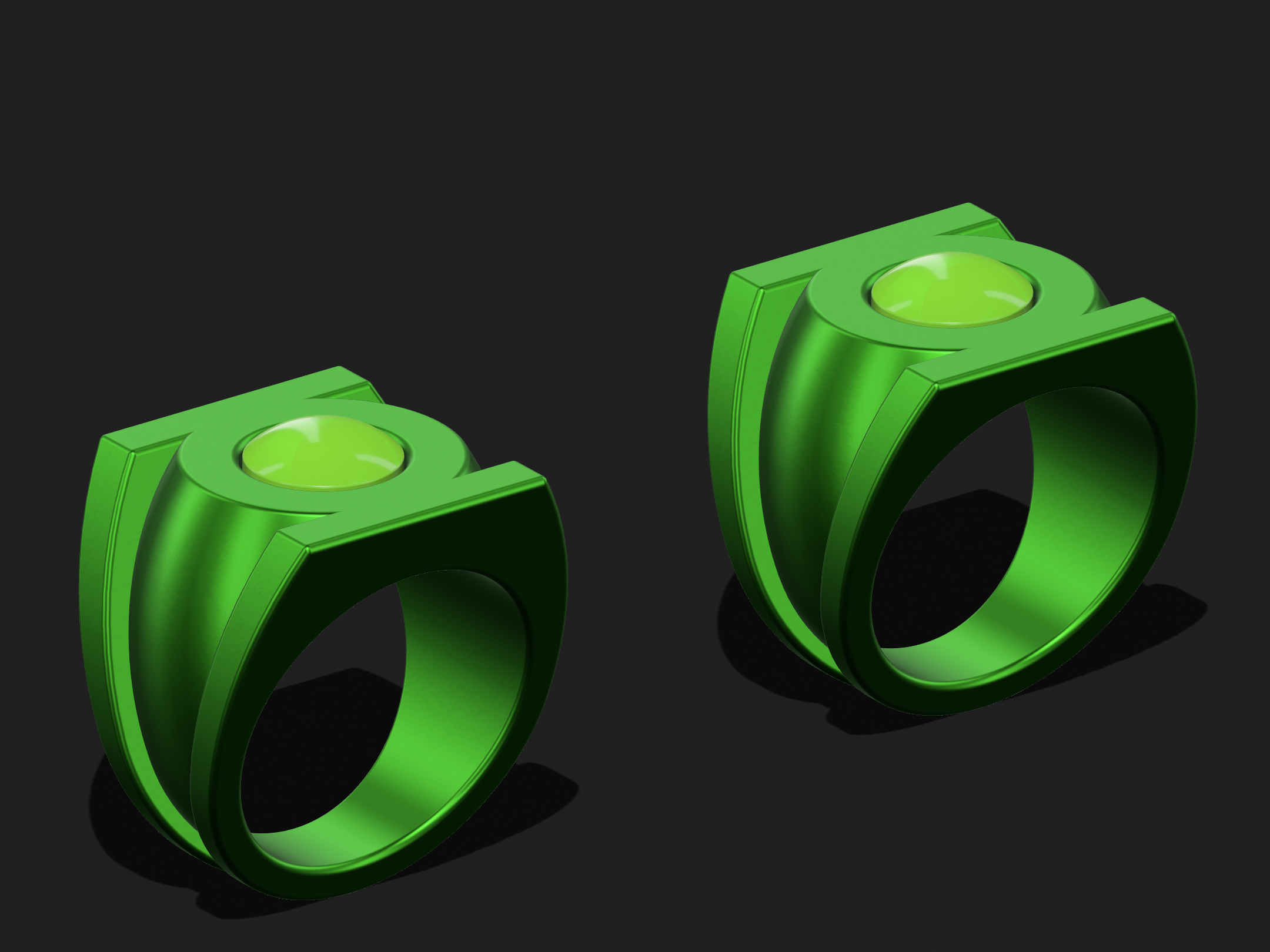
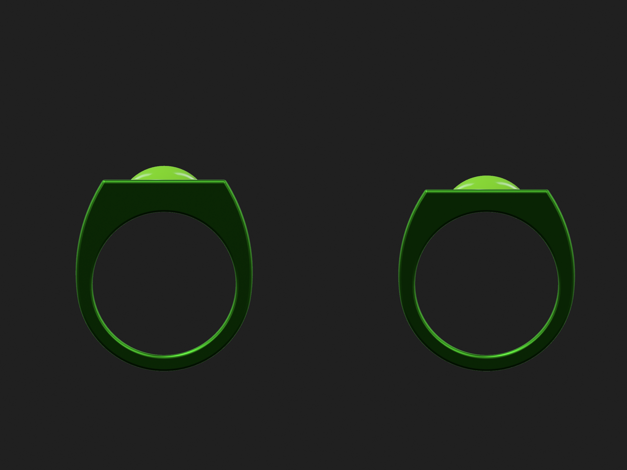
5mm high on the left, 3.5mm on the right.
DexAntares
Well-Known Member
Just got these bad boys in the mail this afternoon. The finish is still raw so I'll need to send them to a jeweler for polishing, then I'll lay down the resin and glow powder. I can't wait~ That's four down, five to go. Since polishing will be a separate step and an additional cost I think I'll try to get one ring a month done from now on. Next is probably going to be Orange/ Avarice or Violet/ Love.
As previously noted, the 22mm V3 seems pretty nice, proportionately, but a 22mm V2 seems too small. Meanwhile, a 24mm V3 seems too big. And I’m trying to keep the symbols the same size on both designs.
I’ve already made 23mm variations of both, and now I’m working on 22.5mm variants to split the difference.
Here’s a 22.5mm V3. It’s all a matter of tinkering with the proportions—the height/amount of material from the finger-hole to face, the thickness of the ribs, etc. I’ve reduced the gap between the inner section and the ribs a bit (from 1mm to 0.5mm) on this version, so the ribs don’t stand quite as proud at the bottom of the shank. Slimmer and less clunky.
Overall, I’m just trying to make the design a bit more compact, and to improve the sleekness of it.
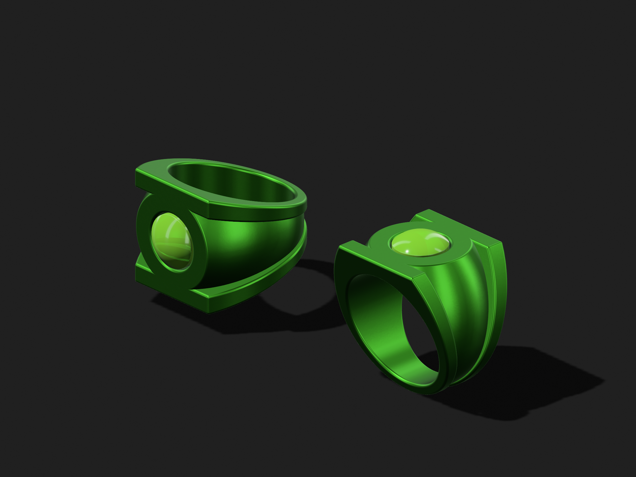
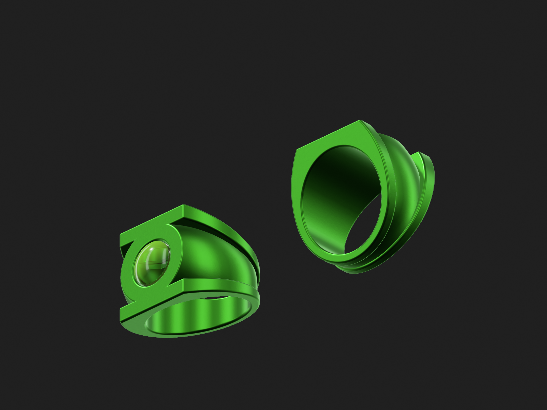
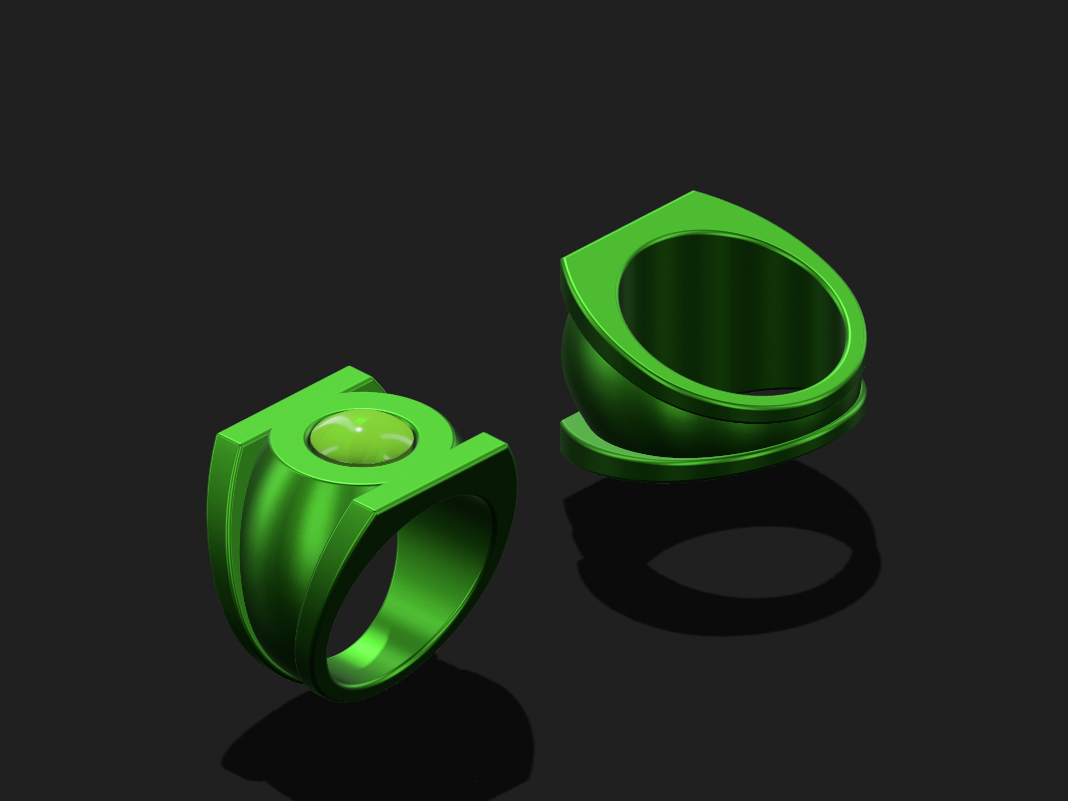
Back to playing around with the Van Sciver 2.0 ring. As usual, the artwork varies considerably. The design could be interpreted as rather flat, like a section cut from a cylinder (a perfect circle in front view, with the symbol just melted across the top), or very organic.
This latest iteration brings more of the shape of the REBIRTH design into it, with a curvy taper in profile view, and more height between the finger-hole and the face. Definitely a more pleasing, organic shape than the previous version, but getting the proportions and the symbol size right is tricky,
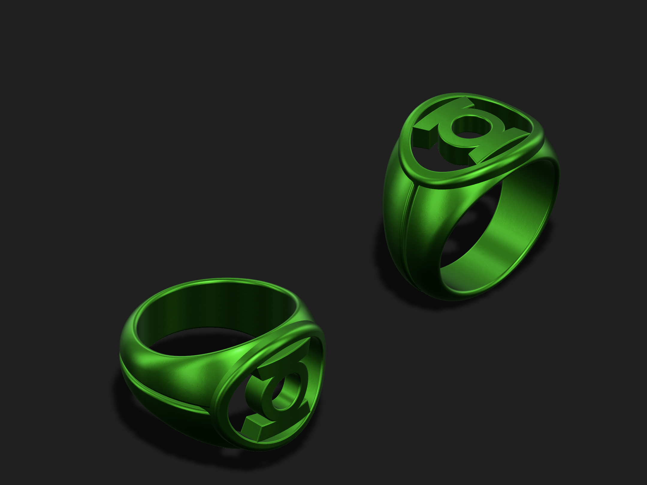
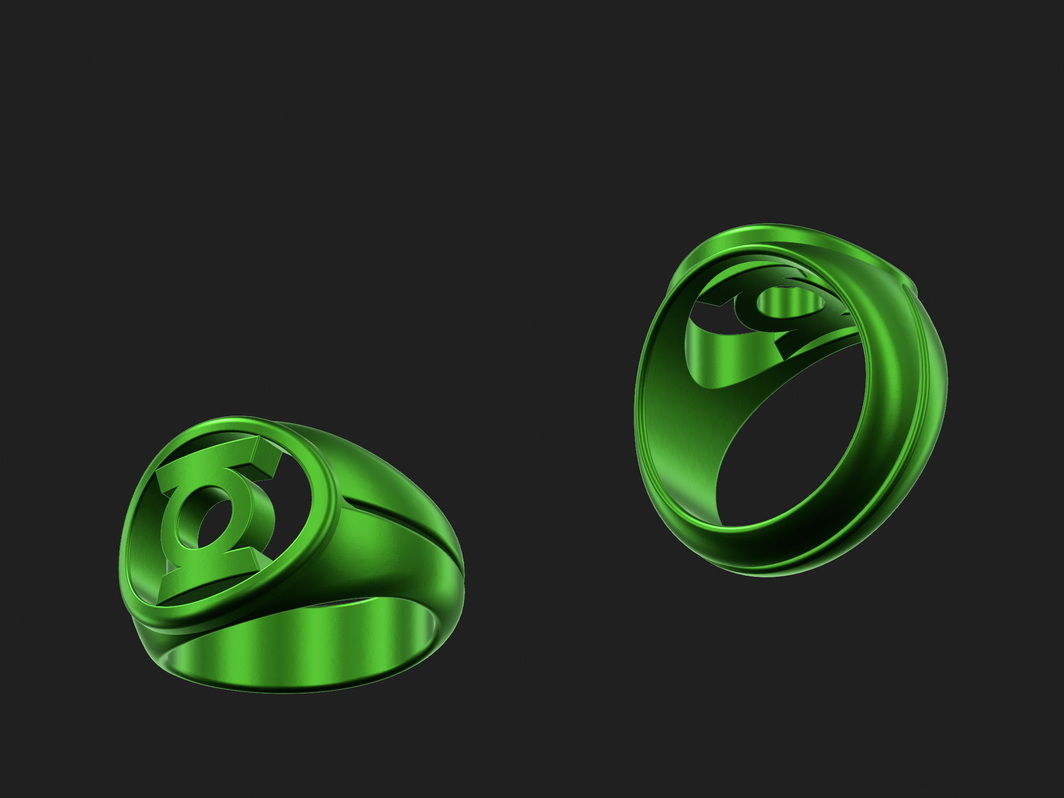
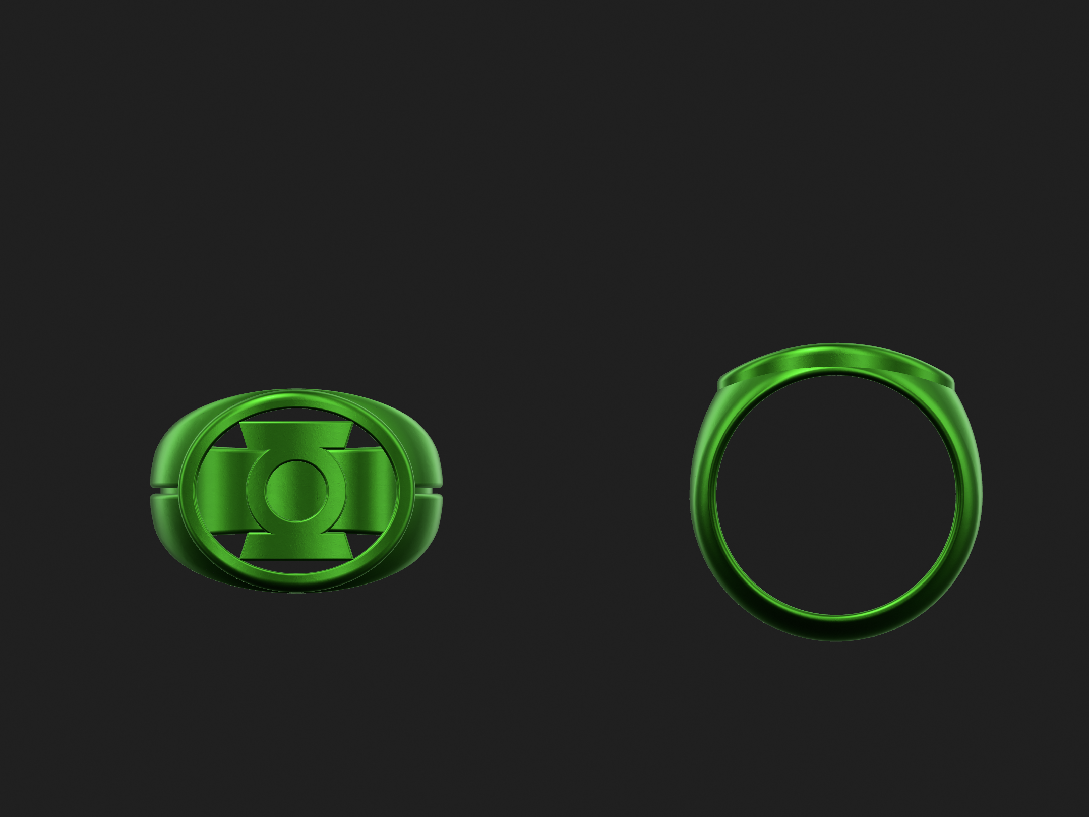
This latest iteration brings more of the shape of the REBIRTH design into it, with a curvy taper in profile view, and more height between the finger-hole and the face. Definitely a more pleasing, organic shape than the previous version, but getting the proportions and the symbol size right is tricky,
Tweaks to calibrate the size, shape, and curvature of the symbol and bezel.
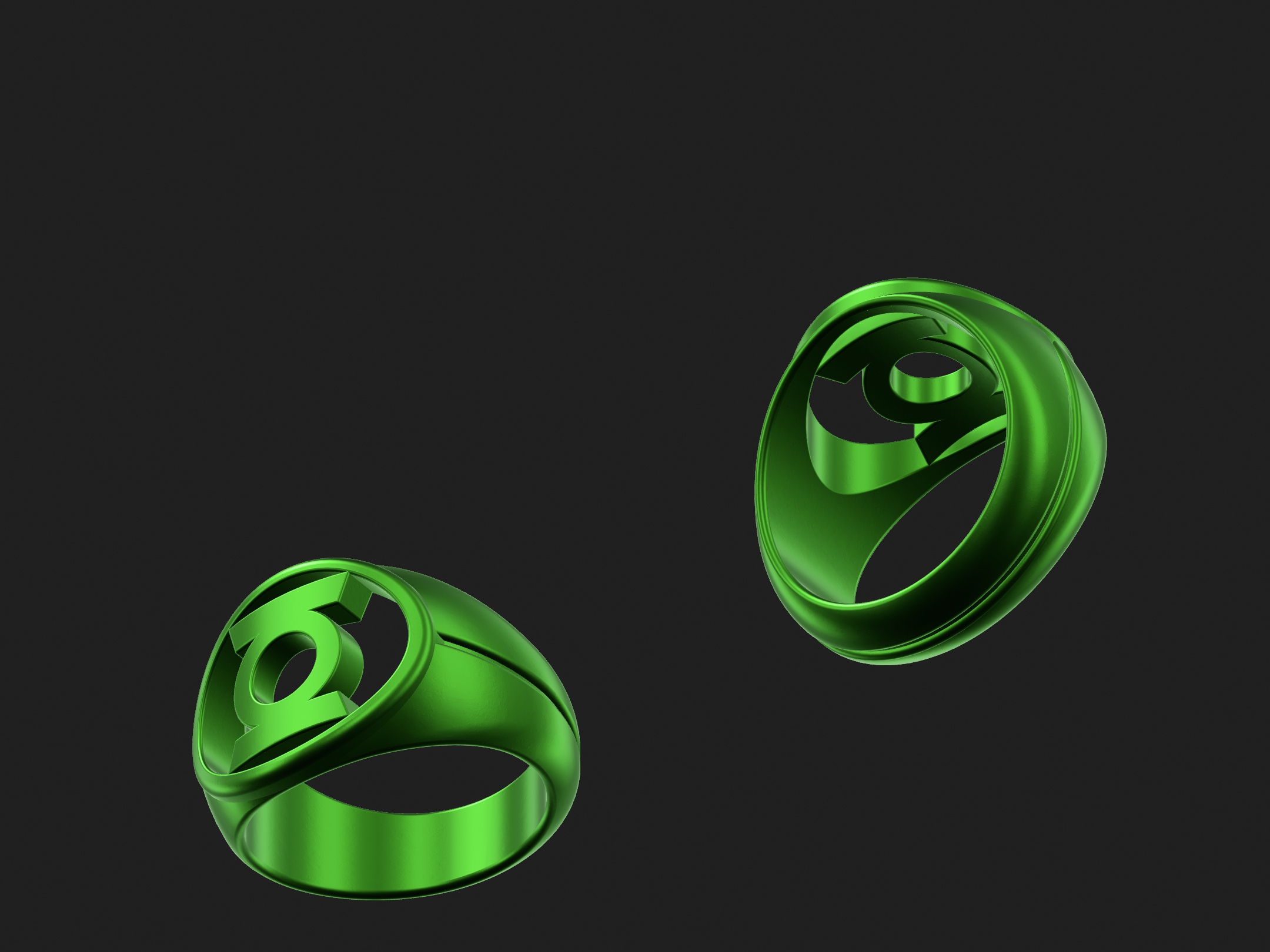
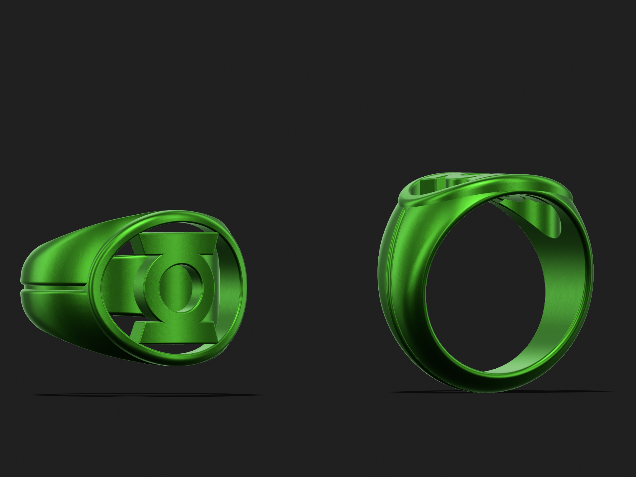
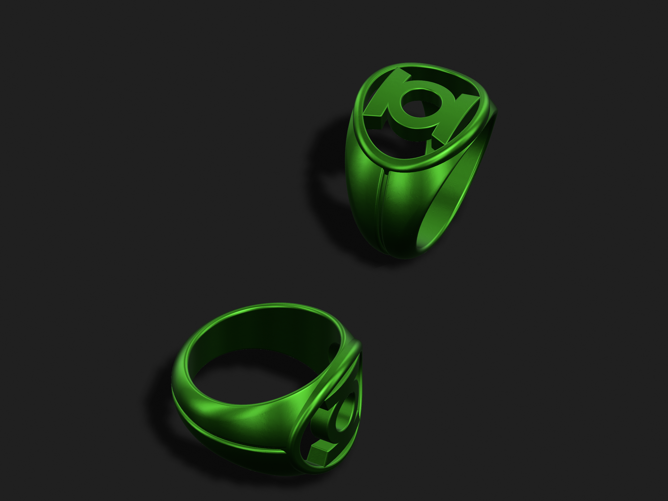
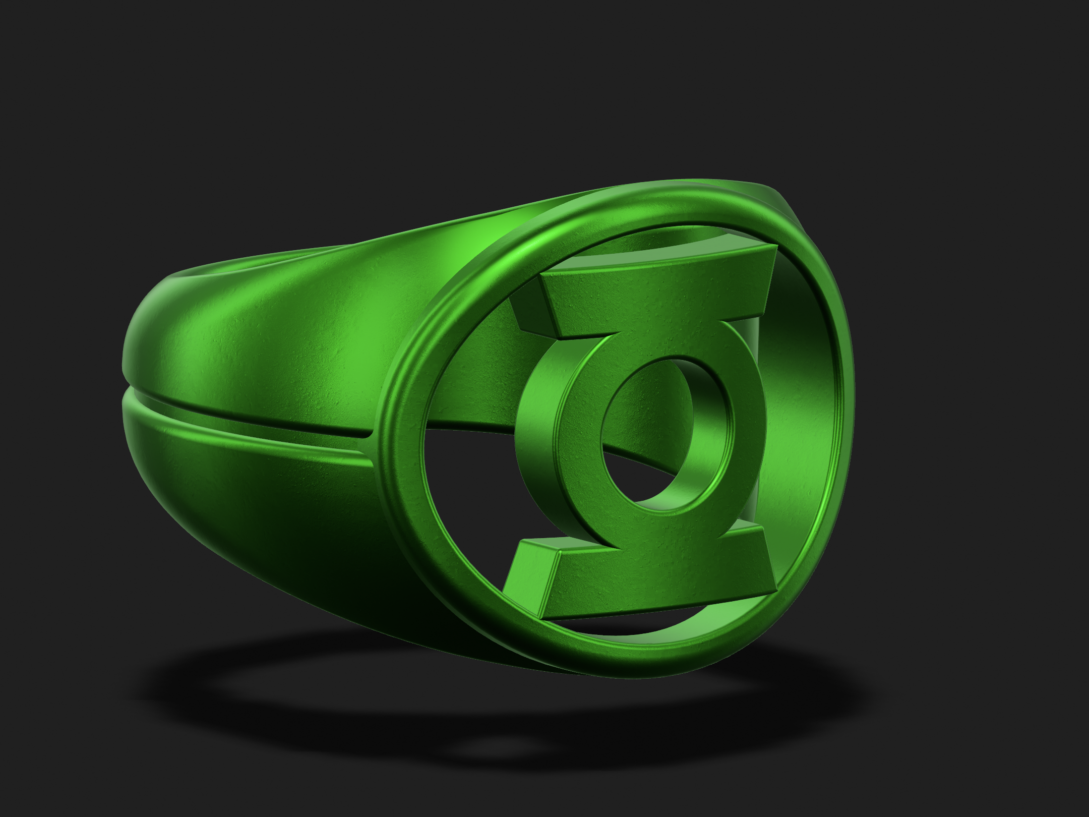
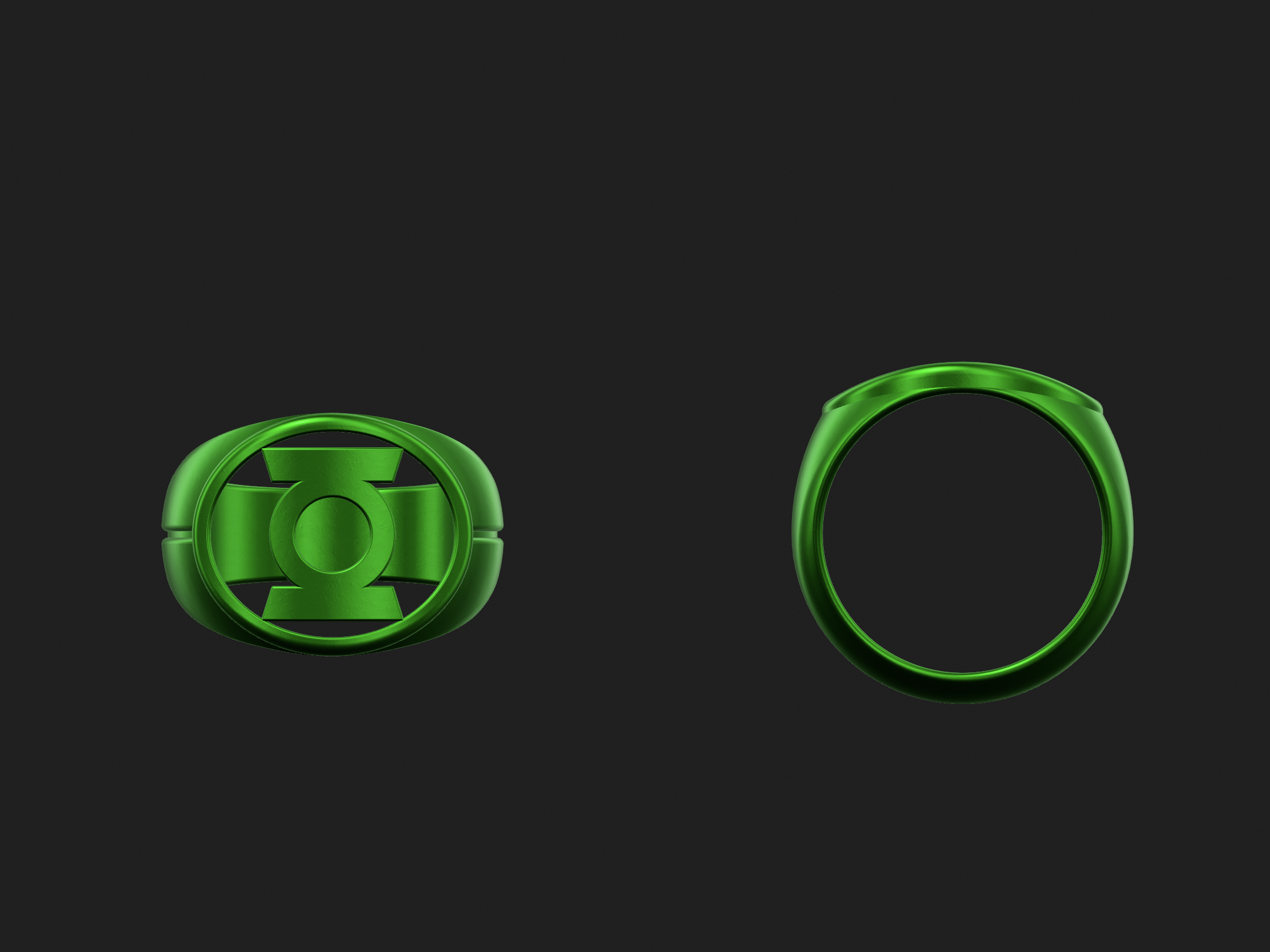
Also, tweaks have been made to the flatter version (which is completely round in front view, rather than being circular at the bottom, then becoming elliptical in the upper half and at the face, like both the above version and a normal signet ring).
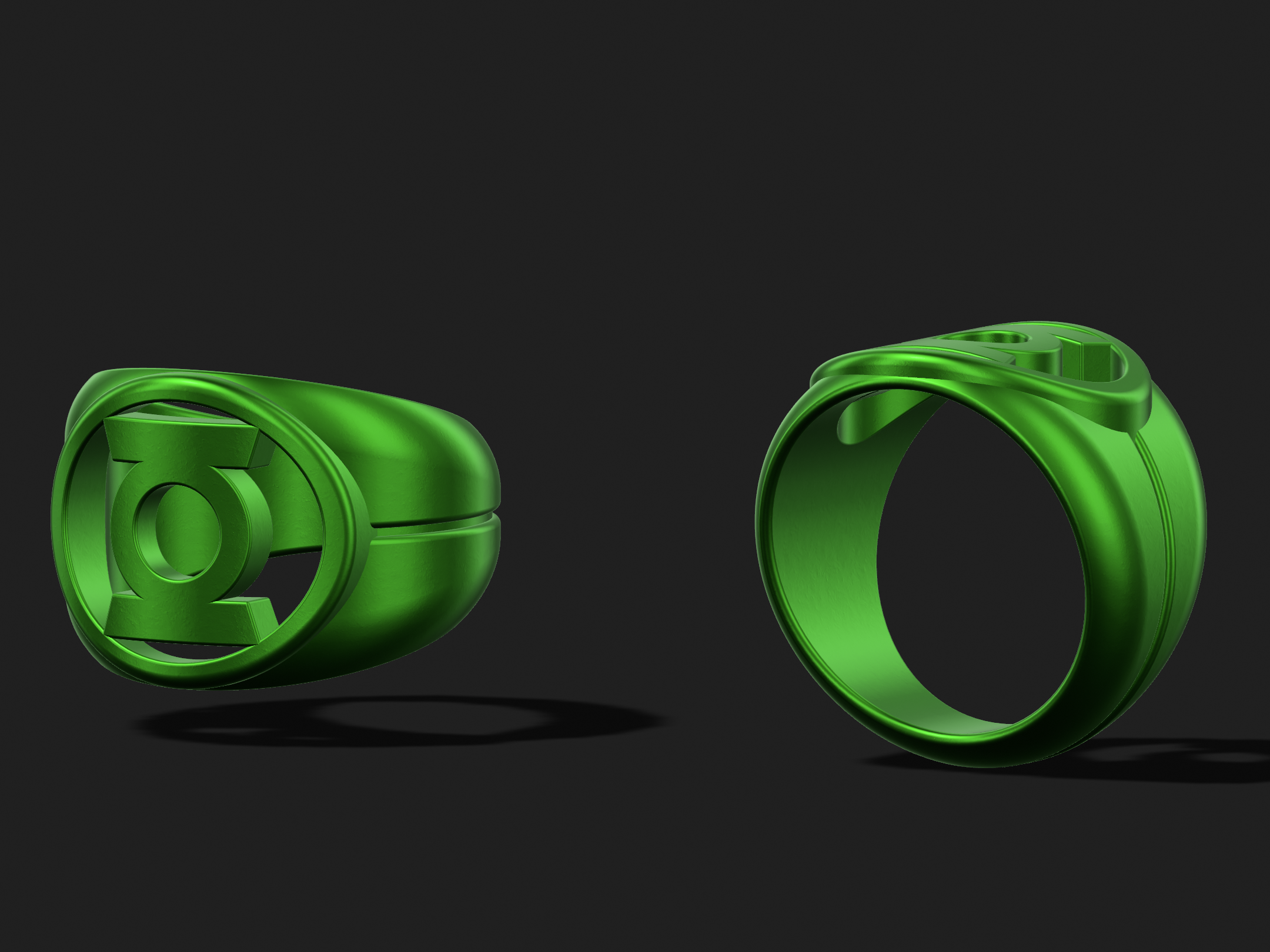
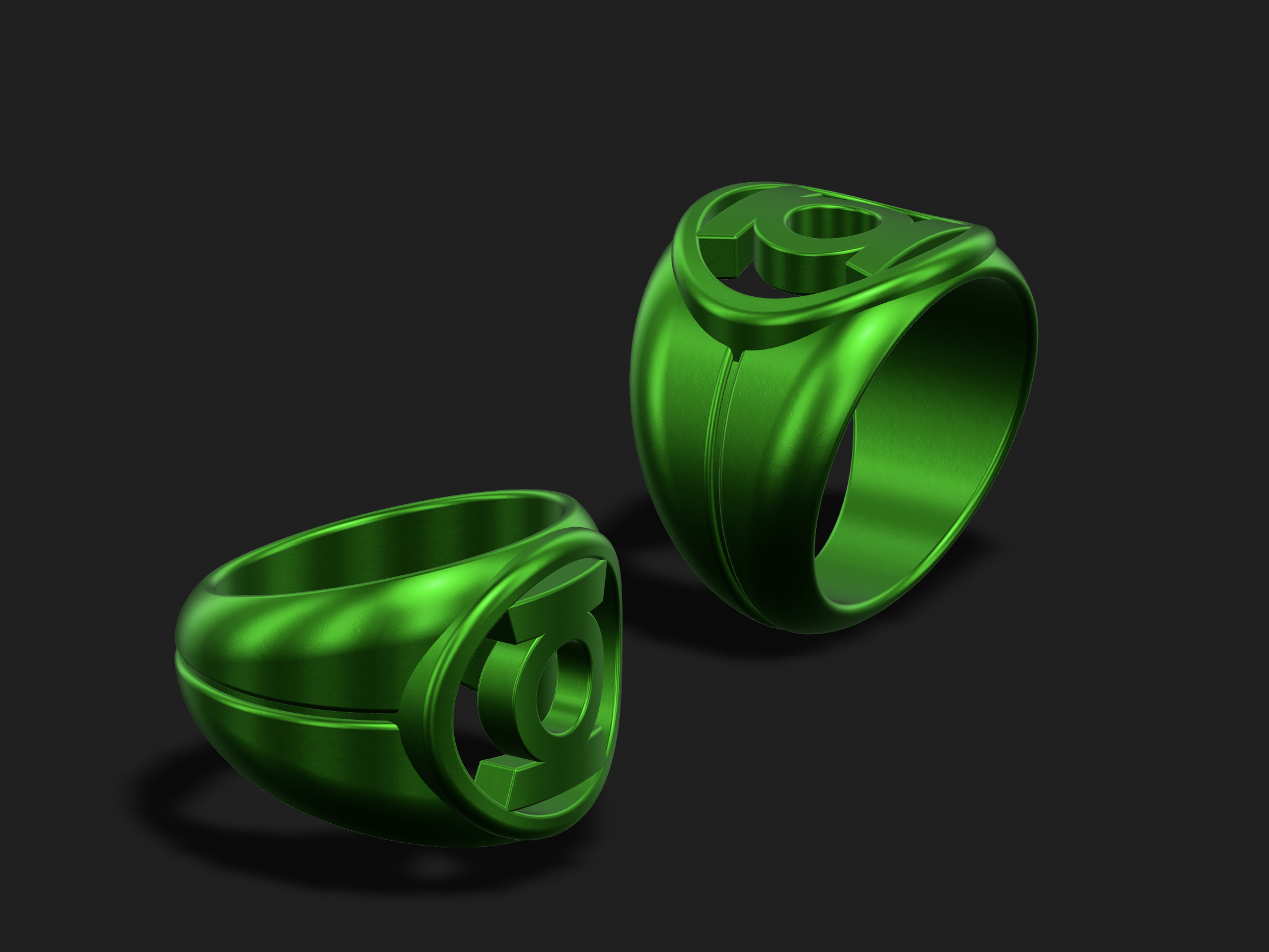
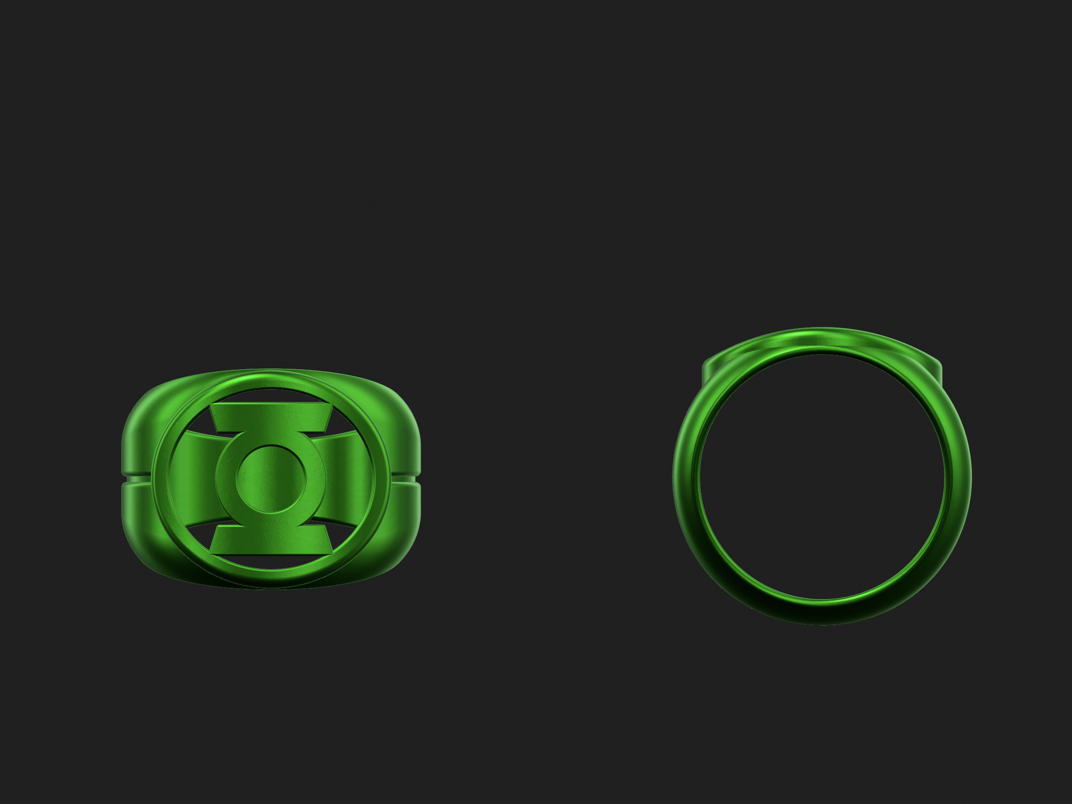
Also, tweaks have been made to the flatter version (which is completely round in front view, rather than being circular at the bottom, then becoming elliptical in the upper half and at the face, like both the above version and a normal signet ring).
DexAntares
Well-Known Member
Lookin' good as always Gregatron . I've got a little bit of an update myself. The Yellow and Indigo rings are still at the jewelers awaiting polishing, but I got an email from them yesterday saying the shanks were too thin and would likely break if polished. I don't understand why 'cause I'm using the same base model I used for my Green and Blue rings, and those turned out fine. I gave the jewelers the order number for the Blue and Green rings and they claimed the shanks were a little thicker on those. I don't think so. They "offered" to charge me an additional $50 per ring to thicken the shanks but I declined and told them to just go ahead with the polishing. I hope they don't "accidentally" break the shanks leaving me little choice but to pay for repairs... in any case I plan to thicken the shank on the model just a bit. I still want to make the rest of the rings so I don't want certain ones looking much different than the ones I've already made.
Lookin' good as always Gregatron . I've got a little bit of an update myself. The Yellow and Indigo rings are still at the jewelers awaiting polishing, but I got an email from them yesterday saying the shanks were too thin and would likely break if polished. I don't understand why 'cause I'm using the same base model I used for my Green and Blue rings, and those turned out fine. I gave the jewelers the order number for the Blue and Green rings and they claimed the shanks were a little thicker on those. I don't think so. They "offered" to charge me an additional $50 per ring to thicken the shanks but I declined and told them to just go ahead with the polishing. I hope they don't "accidentally" break the shanks leaving me little choice but to pay for repairs... in any case I plan to thicken the shank on the model just a bit. I still want to make the rest of the rings so I don't want certain ones looking much different than the ones I've already made.
Might be a change in their liability policy, or something. Ah, well.
Playing with the bezel shape/size some more, and it’s now flush to the edges of the hole.
I’m very happy where this design has gone, although I find myself wondering if it isn’t a little TOO curvy and organic when compared to the source material. Perhaps I try to make a variant with flatter sides. That said, this version essentially looks like a sleeker, more stylized outgrowth of the standard REBIRTH ring, which makes sense.
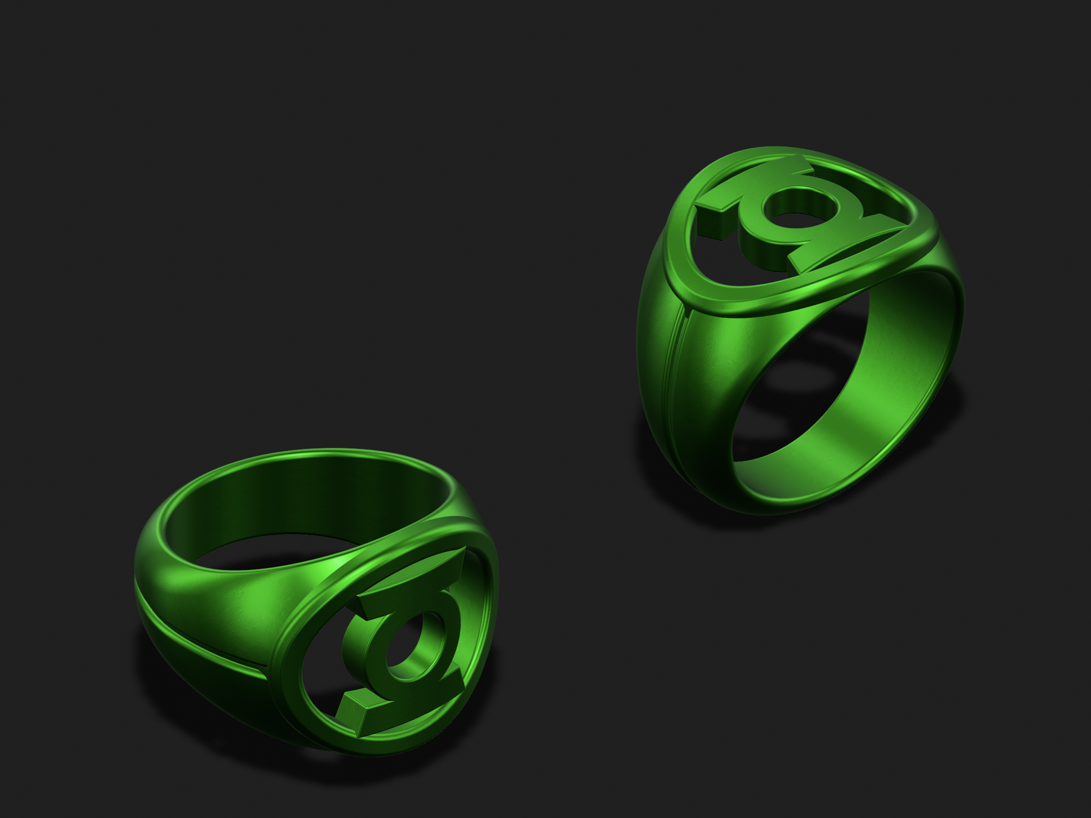
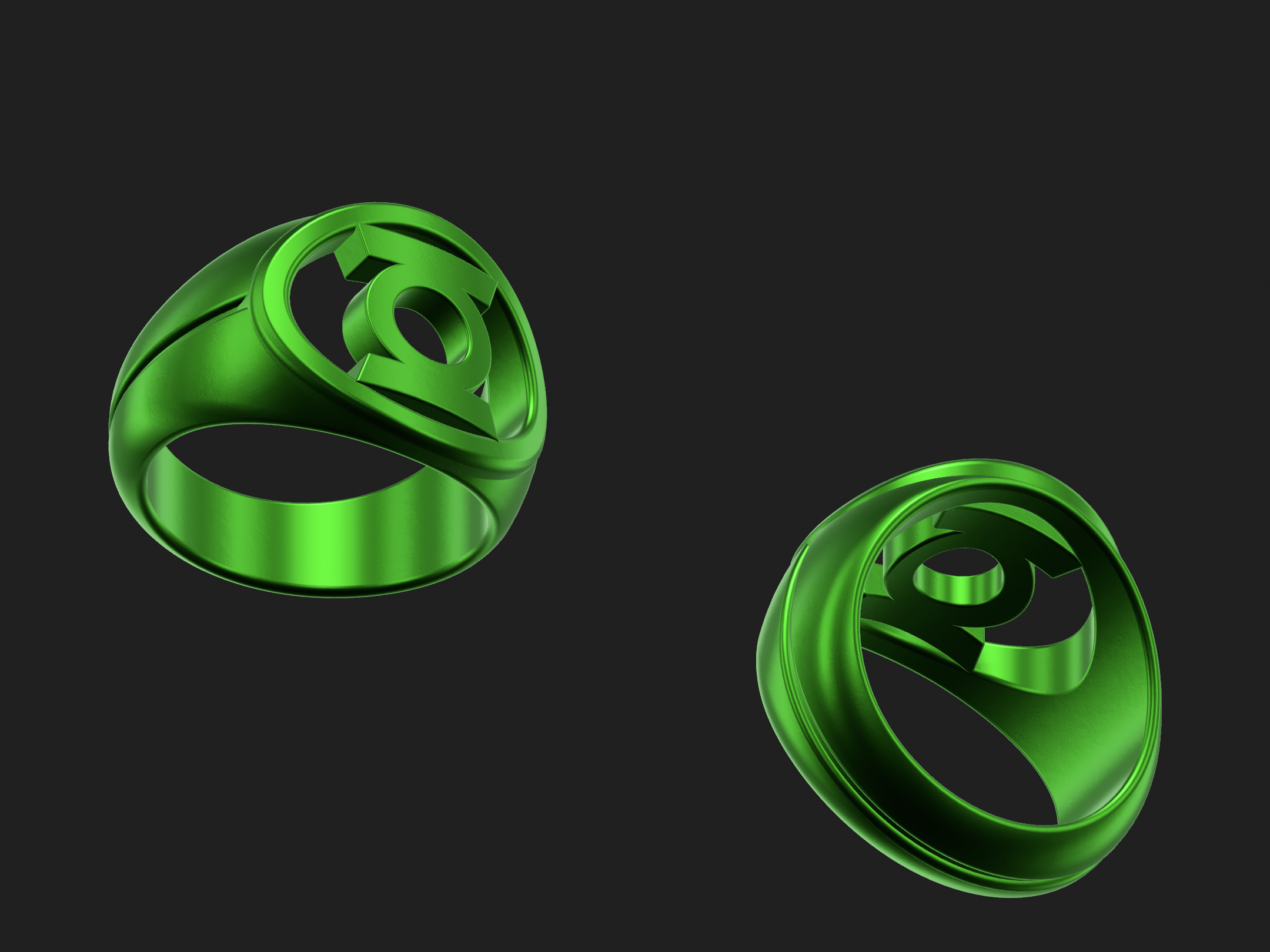
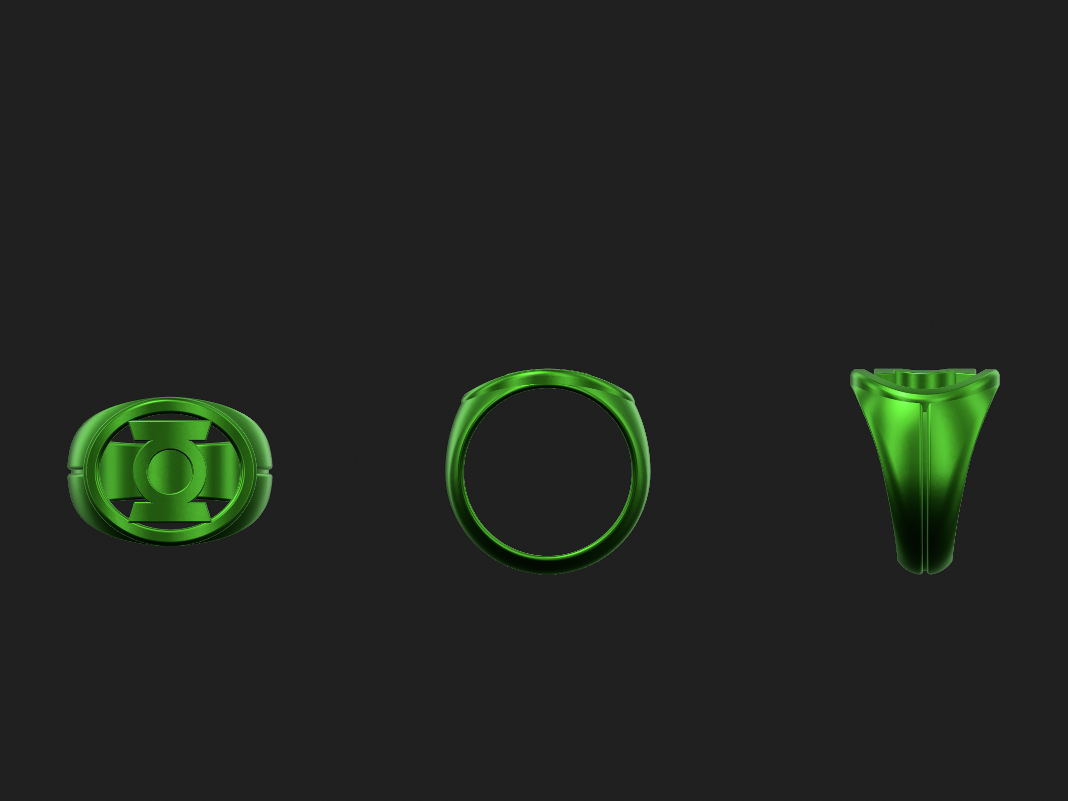
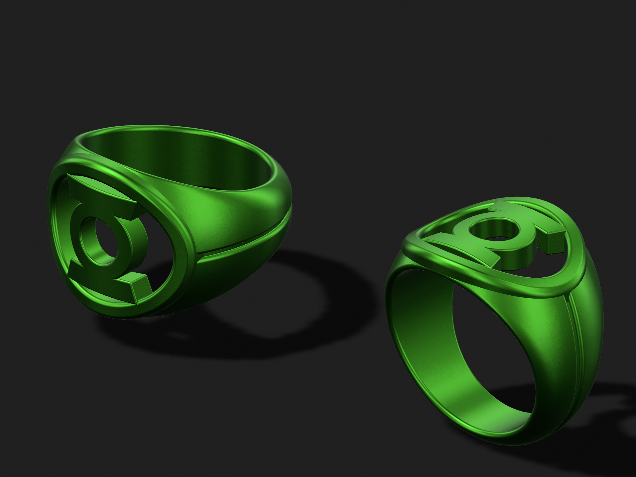
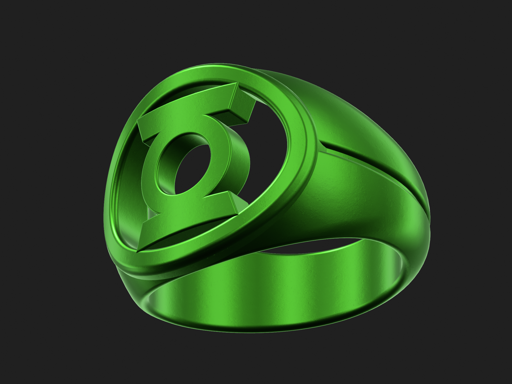
I’m very happy where this design has gone, although I find myself wondering if it isn’t a little TOO curvy and organic when compared to the source material. Perhaps I try to make a variant with flatter sides. That said, this version essentially looks like a sleeker, more stylized outgrowth of the standard REBIRTH ring, which makes sense.
Last edited:
Along with improving the bezel shape, I just made one other little tweak—I noted that, by accident, the symbols on both designs were virtually the same size. Within a few decimal points of each other, in fact. So, I made them exactly the same size, and also changed the thickness of the flat face of the bezel to match that of the REBIRTH. Subtle, but effective.
I’m digging this a lot. It really does look like a stylized outgrowth of the REBIRTH design, which makes sense.
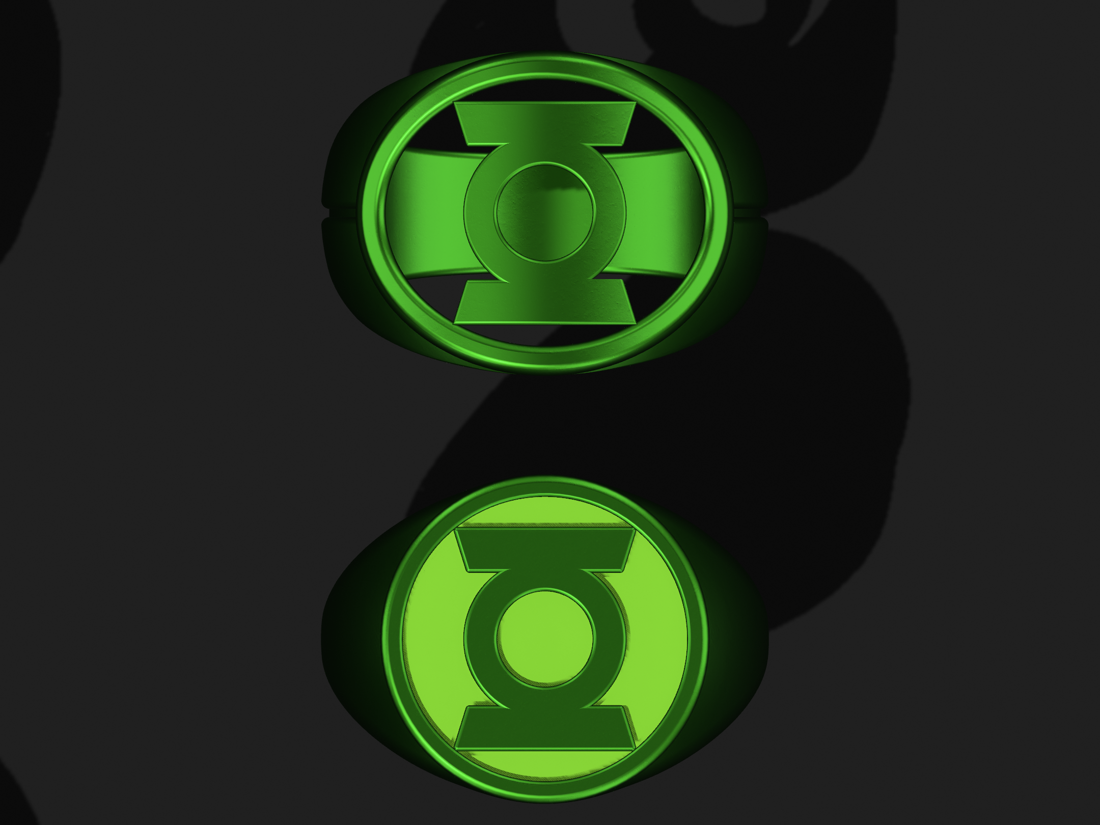
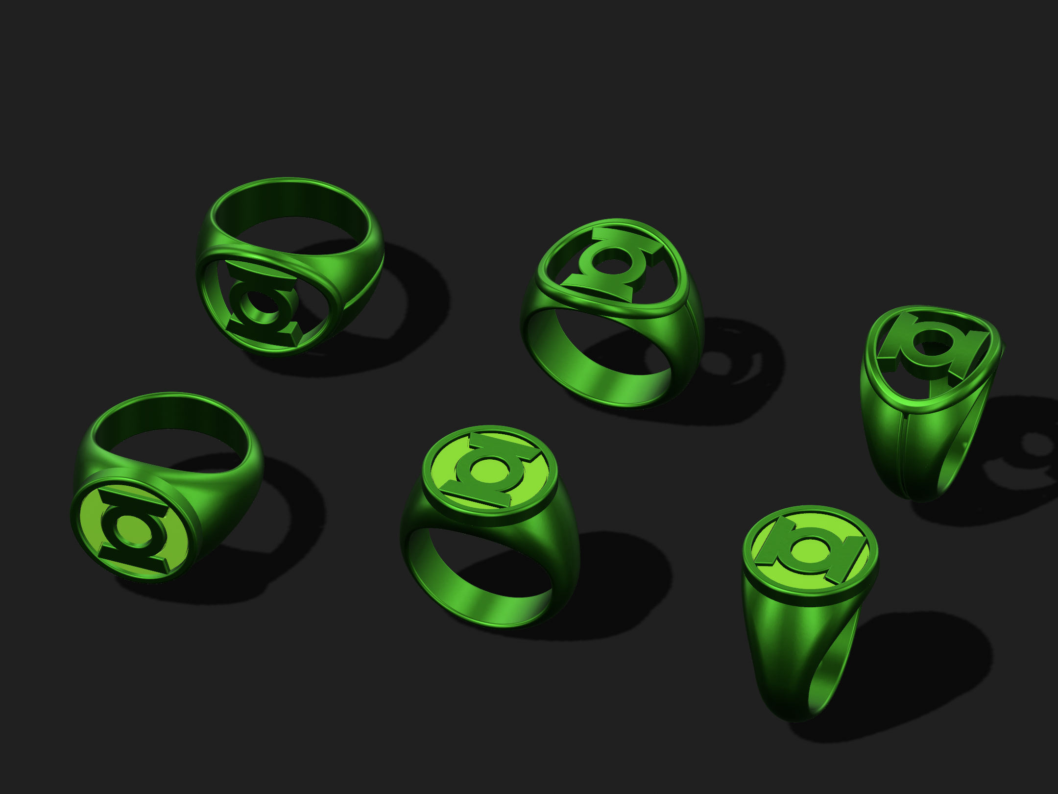
I’m digging this a lot. It really does look like a stylized outgrowth of the REBIRTH design, which makes sense.
DexAntares
Well-Known Member
Might be a change in their liability policy, or something. Ah, well.
First off, your work is looking stellar as always, sir. Love how the Hal ring is turning out.
Second, I got in touch with the jewelers and showed them a reinforcement I added to my signet model. They told me they should be able to work with it, so from now on this is the model I'll be sending them. They should be able to grind down the overlap as they're polishing.
Similar threads
- Replies
- 0
- Views
- 200
- Replies
- 1
- Views
- 233
- Replies
- 3
- Views
- 328
