You are using an out of date browser. It may not display this or other websites correctly.
You should upgrade or use an alternative browser.
You should upgrade or use an alternative browser.
Fate of the Original ANH Vader Mask Confirmed: ESB
- Thread starter SithLord
- Start date
Not sure if these help, but found a few more shots (again, I'm sure the Vader experts are familiar with all these).
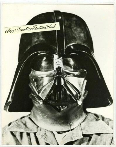
Yep, I own this one... :cool
Too Much Garlic
Master Member
Now those are interesting marks, but anyone can see that they are not even at the same location on the masks and not angling in the same direction. And the damage on the neck-line is non-existent on the Kenny Baker shot.
That's his hair.OT but cool at least to me...this could be the strap on the rear of the mask but almost looks like something round and shiny is part of it...
Too Much Garlic
Master Member
Flashy graphs with inconclusive data and unfounded conclusions does not equal good detective work. There are so many things to concentrate on to try to get a match, but choosing something that cannot offer any conclusions about the masks, but only about the piece examined - in this case the chin vent grill. That's like saying that because it has amber lenses, then it is the same mask. If scratches however in the lenses are similar in both masks, then that heightens the possibility that they are the same, but still not rock solid proof. Glue marks around the lenses that match will offer more evidence. Paint scratches, nicks and dents in the paint, overlaps, overspray, damage that will be unique to one helmet is what you can determine whether pictures of two helmets are in fact showing the same helmet.
With everything that is shown that matches... what about all the things that don't match?
The methods used and the following conclusions are faulty, because proper ways to determine similarity aren't followed. 50% opacity WARPS the two images into each other. I know that for a FACT. I studied the effect when I did my symmetrical studies, where I pasted a mirrored image on top of a regular image and then set it to 50% opacity. When pulling the marker from 0% to 100% you could see the images morph into each other - change shape. So the next time anyone uses 50% opacity pictures to try to prove anything, you've lost my respect and I'll not waste any more time with people using amateurish efforts to push an agenda.
The ESB Poster helmet.

Here's a stormtrooper helmet.

(image used is GINOs stunt - can remove it if requested.)
And this one's just for fun, showing the Don Post style of symmetrical and the more accurate way of doing symmetrical.

EDIT: Thought I'd add a little more.
The misleading of cropped pictures. When you look at the cropped out pictures of the two necklines, you see that they have similar details, but what you don't see in those, is how they are cropped out at different locations on the neck - which you only see in the full pictures. I've drawn two thick red lines on both helmets to indicate two things - one line down the center of the neck from the chin vent point + the paint drip that are on authentic helmets. When you draw in those lines you can clearly see that the two highlighted features on the neck that are claimed to be the same on both masks are at different sections of the neck.

With everything that is shown that matches... what about all the things that don't match?
The methods used and the following conclusions are faulty, because proper ways to determine similarity aren't followed. 50% opacity WARPS the two images into each other. I know that for a FACT. I studied the effect when I did my symmetrical studies, where I pasted a mirrored image on top of a regular image and then set it to 50% opacity. When pulling the marker from 0% to 100% you could see the images morph into each other - change shape. So the next time anyone uses 50% opacity pictures to try to prove anything, you've lost my respect and I'll not waste any more time with people using amateurish efforts to push an agenda.
The ESB Poster helmet.

Here's a stormtrooper helmet.

(image used is GINOs stunt - can remove it if requested.)
And this one's just for fun, showing the Don Post style of symmetrical and the more accurate way of doing symmetrical.

EDIT: Thought I'd add a little more.
The misleading of cropped pictures. When you look at the cropped out pictures of the two necklines, you see that they have similar details, but what you don't see in those, is how they are cropped out at different locations on the neck - which you only see in the full pictures. I've drawn two thick red lines on both helmets to indicate two things - one line down the center of the neck from the chin vent point + the paint drip that are on authentic helmets. When you draw in those lines you can clearly see that the two highlighted features on the neck that are claimed to be the same on both masks are at different sections of the neck.

Last edited:
Yep, I own this one... :cool
Just to correct, I just own the picture not the rights to it of course...
Too Much Garlic
Master Member
For the future... please show the whole picture when doing these crop-outs as I've already shown that your crop-outs are misleading.
EDIT: I can barely make out the scratches in the lenses on the KB photo, but that is certainly one of the more interesting comparisons. I don't buy the neck example, as I'm not seeing anything there that matches.
EDIT: I can barely make out the scratches in the lenses on the KB photo, but that is certainly one of the more interesting comparisons. I don't buy the neck example, as I'm not seeing anything there that matches.
Last edited:
CSMacLaren
Sr Member
After watching these debates over the past several years over what's valid photo analysis, I think something needs to be said about the limitations of the analysis tools.
As I look at these comparisons, it's clear that we are running into the law of diminishing returns: when you blow up poor resolution images, you introduce a minefield of false-positives to the point that anything can be interpreted as "evidence". The flaw of Photoshop comparisons at this point is that unless you eliminate the false-positives, any analysis can be skewed as "proof".
Then when you add on top of this flawed method of analysis scientific tools, graphs, etc. they will all appear authoritative to the uninitiated.
In other for this method of analysis to not turn into a farce, all FALSE POSITIVES have to be eliminated. In other words, before any claim of "proof" can be made, one must first disprove any chance that conflicting elements cannot possibly lead to a different conclusion. It is, however, harder to disprove something than to prove something, but without controls in the verification of a hypothesis, the "scientific method" is not lived up to.
I am also concerned that those uninitiated in props or Vader are too quickly wowed by fancy comparisons and, as a result, are taking things as gospel and fact before they've had a chance to develop their own prop and photo analysis abilities.
What is a False Positive?
What is a false positive? In our case it's a visual phenomenon that seems to corroborate with our hypothesis and observations, but it's not 100% clear what it is, and there is a strong chance it is being incorrectly interpreted. One therefore has to eliminate the possibility that it's not on the prop but a visual phenomenon created by any of the following:
1. Film grain. Here, we're talking about the grain of period silver halide film when the photo was originally taken (many set photographers used ASA 1600 film to allow for faster shutter speeds to reduce motion blur. A lot of set photography does not use camera flash. The set can be dark, so the more sensitive ASA 1600 film makes up for it. And silver halide film today is less grainy than back in the day of Star Wars)
2. Analog to digital conversion noise. Each time you scan a photo, there is a possibility of noise and distortion that has to be digitally cleaned up. In the world of video, there are digital errors, signal degradation, bit errors and the like, and there are algorithms that allow for some degree of error reduction.
3. Dust. Whether someone is peering down a microscope or using a flatbed scanner to scan a photo, the optics of the scanner may pick up dust that the human eye an barely see. You often get all kinds of white dots and lines in a scanned photograph. Sometimes if a photo is particularly grainy, it may be hard to distinguish between white dots in the photographic paper versus white phenomenon created by dust on the glass of a scanner.
4. Video compression. Video compression is lossy, because they have to throw away digital information in order to compress a signal and make it viewable. That is why when you watch a HD broadcast, it may look great, but having a Blu-Ray that's been properly encoded will almost always look much better. The nature of digital compression however is that it creates "artifacts". When you watch a DVD or HD, you may notice a very subtle noise in the background to the actors, even if the actors aren't moving. With poorly compressed or encoded DVDs or HDs, the noise is very noticeable. If you hit "Pause" you may even start seeing squarish or rectangular formations that aren't particularly pleasing to the eye. But un-pause the video, and it goes by so quickly that hopefully you would not notice.
5. Photoshop. Yes, as much as we rely on this, it can also introduce false positives.
6. Light reflection. White dots on a photograph that are created by light reflections do not necessarily indicate the shape of the surface reflecting that light. Often a camera lens and film grain may respond differently to certain light intensities. If light is intense, you might get a blur or flare that may appear larger than the actual reflecting surface.
I don't want to over-complicate things here, but - no offense to anyone - I want to see people educated on false positives before quickly accepting that looks or sounds authoritative but that doesn't help the hobby in the long run.
Where Tools Alone Do Not Tell The Truth
Let's say someone sees a detail on his Vader mask and compares that detail with a picture of the original. He eventually finds an image like this:
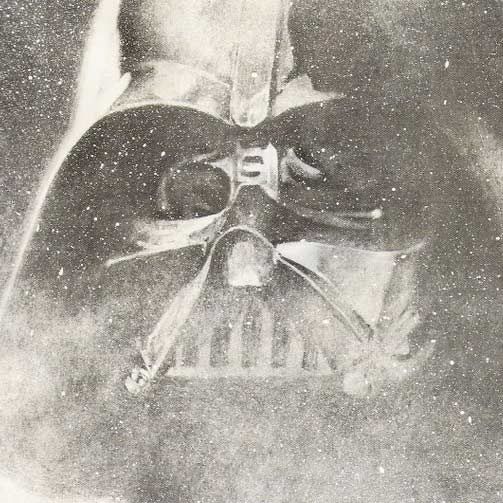
And he finds that a few dots line up.
As Carsten has indicated, if you only focus on the dots that line up and disregard the dots that don't, you can't draw a quick conclusion that it's "Proof".
In fact, the above image was used once as proof. Here's the problem: the false positives were not eliminated.
1. Have we eliminated the possibility the white dots that line up are aspects of the prop and not the starfield itself?
2. Have we eliminated the possibility the white dots are not dust from a flatbed scanner? Best of yet:
3. Has it been ascertained that this was a photo to begin with and not an airbrushed and handpainted work of art based on a photo? (Recall, they didn't have Photoshop back then. This was likely not created by reducing Vader to 50% opacity and overlaying him among a starfield.)
The last time we debated over the above photograph, the answers were No, No, and NO. Therefore saying "The dots line up" and concluding "Proof" is premature.
Do we want to agree? Absolutely. After all, we all stand to gain from learning something new. But it must be done correctly.
Where Photoshop can let you down
Now here is where Photoshop can let you down.
Let's just pretend we're comparing the cheek of this painting. Again, the dots could be part of the painted starfield. We can't rush to a conclusion that the Vader is a faded photograph because, unless we can prove they created this image using transparent film overlays, the brushed and airbrushed quality of the image indicates art and not a photo.
Let's darken this and look at the cheek.
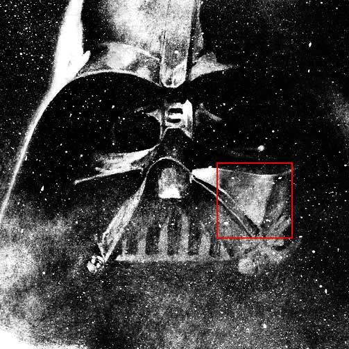
Is the starfield even a photograph? I'm leaning forwards airbrushed art, as I've seen a local street artist paint starfields with rattle cans and they look phenomenal.
Now notice this image has been darkened, but the starting image was also compressed to begin with, so the image quality is not there.
Everyone, please note: You are looking at a 72 dot per inch image. People have the misconception that if you take an image of this low resolution and blow it up, that you'll magnify into all kinds of cool details. You don't.
Now the person using Photoshop would be able to show you an image of the cheek looking like this.
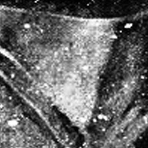
Again, there is NO WAY to distinguish between image noise, starfield "noise" and prop surface structure. Under these circumstances, Photoshop is of LITTLE VALUE.
It can be argued that certain white dots are indeed structures. Before that assessment is made and passed as "Proof" one must eliminate the possibility it's not a starfield, or noise, or dust, etc.
Here is something about Photoshop some people may not be aware of. In magnifying an area so small which in turn contains little graphical information, Photoshop will try to smoothe things out. If it hadn't, the above image would actually look like this:
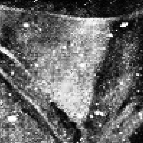
Now THAT is an image that is almost utterly USELESS to work with. A tool is only as good as you are aware of its strengths and weaknesses, and you account for that in your analysis.
See the difference between the above two images: Photoshop-processed versus blown-up in a raw state. When a low-res image is blown up by Photoshop, Photoshop interprets the pixels and decides what to smooth out versus what to let through. What it lets through can hardly be a slam-dunk indication of surface details. At best, you can do some line overlay comparisons.
Summary
When trying to prove something, you start with a hypothesis. But you have to also disprove things that suggest otherwise. It's harder to disprove something than to prove something because of the extra effort required to eliminate the false positives.
In the end, we cannot know for sure without evidence, so at best we can move from "hypothesis" to "theory". Otherwise, we create a prop culture where, year after year, people pass on suppositions as facts, and the uninitiated listen to authoritative sounding people and assume they are experts. People also need to be aware of the level of graphical information that exists - or does not exist - in images.
As I look at these comparisons, it's clear that we are running into the law of diminishing returns: when you blow up poor resolution images, you introduce a minefield of false-positives to the point that anything can be interpreted as "evidence". The flaw of Photoshop comparisons at this point is that unless you eliminate the false-positives, any analysis can be skewed as "proof".
Then when you add on top of this flawed method of analysis scientific tools, graphs, etc. they will all appear authoritative to the uninitiated.
In other for this method of analysis to not turn into a farce, all FALSE POSITIVES have to be eliminated. In other words, before any claim of "proof" can be made, one must first disprove any chance that conflicting elements cannot possibly lead to a different conclusion. It is, however, harder to disprove something than to prove something, but without controls in the verification of a hypothesis, the "scientific method" is not lived up to.
I am also concerned that those uninitiated in props or Vader are too quickly wowed by fancy comparisons and, as a result, are taking things as gospel and fact before they've had a chance to develop their own prop and photo analysis abilities.
What is a False Positive?
What is a false positive? In our case it's a visual phenomenon that seems to corroborate with our hypothesis and observations, but it's not 100% clear what it is, and there is a strong chance it is being incorrectly interpreted. One therefore has to eliminate the possibility that it's not on the prop but a visual phenomenon created by any of the following:
1. Film grain. Here, we're talking about the grain of period silver halide film when the photo was originally taken (many set photographers used ASA 1600 film to allow for faster shutter speeds to reduce motion blur. A lot of set photography does not use camera flash. The set can be dark, so the more sensitive ASA 1600 film makes up for it. And silver halide film today is less grainy than back in the day of Star Wars)
2. Analog to digital conversion noise. Each time you scan a photo, there is a possibility of noise and distortion that has to be digitally cleaned up. In the world of video, there are digital errors, signal degradation, bit errors and the like, and there are algorithms that allow for some degree of error reduction.
3. Dust. Whether someone is peering down a microscope or using a flatbed scanner to scan a photo, the optics of the scanner may pick up dust that the human eye an barely see. You often get all kinds of white dots and lines in a scanned photograph. Sometimes if a photo is particularly grainy, it may be hard to distinguish between white dots in the photographic paper versus white phenomenon created by dust on the glass of a scanner.
4. Video compression. Video compression is lossy, because they have to throw away digital information in order to compress a signal and make it viewable. That is why when you watch a HD broadcast, it may look great, but having a Blu-Ray that's been properly encoded will almost always look much better. The nature of digital compression however is that it creates "artifacts". When you watch a DVD or HD, you may notice a very subtle noise in the background to the actors, even if the actors aren't moving. With poorly compressed or encoded DVDs or HDs, the noise is very noticeable. If you hit "Pause" you may even start seeing squarish or rectangular formations that aren't particularly pleasing to the eye. But un-pause the video, and it goes by so quickly that hopefully you would not notice.
5. Photoshop. Yes, as much as we rely on this, it can also introduce false positives.
6. Light reflection. White dots on a photograph that are created by light reflections do not necessarily indicate the shape of the surface reflecting that light. Often a camera lens and film grain may respond differently to certain light intensities. If light is intense, you might get a blur or flare that may appear larger than the actual reflecting surface.
I don't want to over-complicate things here, but - no offense to anyone - I want to see people educated on false positives before quickly accepting that looks or sounds authoritative but that doesn't help the hobby in the long run.
Where Tools Alone Do Not Tell The Truth
Let's say someone sees a detail on his Vader mask and compares that detail with a picture of the original. He eventually finds an image like this:

And he finds that a few dots line up.
As Carsten has indicated, if you only focus on the dots that line up and disregard the dots that don't, you can't draw a quick conclusion that it's "Proof".
In fact, the above image was used once as proof. Here's the problem: the false positives were not eliminated.
1. Have we eliminated the possibility the white dots that line up are aspects of the prop and not the starfield itself?
2. Have we eliminated the possibility the white dots are not dust from a flatbed scanner? Best of yet:
3. Has it been ascertained that this was a photo to begin with and not an airbrushed and handpainted work of art based on a photo? (Recall, they didn't have Photoshop back then. This was likely not created by reducing Vader to 50% opacity and overlaying him among a starfield.)
The last time we debated over the above photograph, the answers were No, No, and NO. Therefore saying "The dots line up" and concluding "Proof" is premature.
Do we want to agree? Absolutely. After all, we all stand to gain from learning something new. But it must be done correctly.
Where Photoshop can let you down
Now here is where Photoshop can let you down.
Let's just pretend we're comparing the cheek of this painting. Again, the dots could be part of the painted starfield. We can't rush to a conclusion that the Vader is a faded photograph because, unless we can prove they created this image using transparent film overlays, the brushed and airbrushed quality of the image indicates art and not a photo.
Let's darken this and look at the cheek.

Is the starfield even a photograph? I'm leaning forwards airbrushed art, as I've seen a local street artist paint starfields with rattle cans and they look phenomenal.
Now notice this image has been darkened, but the starting image was also compressed to begin with, so the image quality is not there.
Everyone, please note: You are looking at a 72 dot per inch image. People have the misconception that if you take an image of this low resolution and blow it up, that you'll magnify into all kinds of cool details. You don't.
Now the person using Photoshop would be able to show you an image of the cheek looking like this.

Again, there is NO WAY to distinguish between image noise, starfield "noise" and prop surface structure. Under these circumstances, Photoshop is of LITTLE VALUE.
It can be argued that certain white dots are indeed structures. Before that assessment is made and passed as "Proof" one must eliminate the possibility it's not a starfield, or noise, or dust, etc.
Here is something about Photoshop some people may not be aware of. In magnifying an area so small which in turn contains little graphical information, Photoshop will try to smoothe things out. If it hadn't, the above image would actually look like this:

Now THAT is an image that is almost utterly USELESS to work with. A tool is only as good as you are aware of its strengths and weaknesses, and you account for that in your analysis.
See the difference between the above two images: Photoshop-processed versus blown-up in a raw state. When a low-res image is blown up by Photoshop, Photoshop interprets the pixels and decides what to smooth out versus what to let through. What it lets through can hardly be a slam-dunk indication of surface details. At best, you can do some line overlay comparisons.
Summary
When trying to prove something, you start with a hypothesis. But you have to also disprove things that suggest otherwise. It's harder to disprove something than to prove something because of the extra effort required to eliminate the false positives.
In the end, we cannot know for sure without evidence, so at best we can move from "hypothesis" to "theory". Otherwise, we create a prop culture where, year after year, people pass on suppositions as facts, and the uninitiated listen to authoritative sounding people and assume they are experts. People also need to be aware of the level of graphical information that exists - or does not exist - in images.
For the future... please show the whole picture when doing these crop-outs as I've already shown that your crop-outs are misleading.
EDIT: I can barely make out the scratches in the lenses on the KB photo, but that is certainly one of the more interesting comparisons. I don't buy the neck example, as I'm not seeing anything there that matches.
Yoiks! If I did that the image would be huge! :eek
With the neck example think about how when you see light reflected off a surface, depending on the surface irregularity it will reflect differently but it can show a shape. So the ESB shot shows the reflection of a repainted surface, the original ANH shows a nonreflective angle but there's indication of surface irregularity especially on the left side.
Summary
When trying to prove something, you start with a hypothesis. But you have to also disprove things that suggest otherwise. It's harder to disprove something than to prove something because of the extra effort required to eliminate the false positives.
In the end, we cannot know for sure without evidence, so at best we can move from "hypothesis" to "theory". Otherwise, we create a prop culture where, year after year, people pass on suppositions as facts, and the uninitiated listen to authoritative sounding people and assume they are experts. People also need to be aware of the level of graphical information that exists - or does not exist - in images.
"My God, it's full of stars...."
(just kidding)
Mac, I appreciate the effort you show in trying to explain the problem noise can introduce into an image but I would keep in mind that it boils down to the signal to noise ratio. Clearly the overlays of the grill are based on the higher intensity components representing the intersection points of the mesh, for example. If I overlay noise from two different sources then it won't line up. That last set of comparisons I just offer for people to judge for themselves. I've convinced myself at this point and anyone is welcome to show me how it doesn't work, as Carsten has tried. But the approach itself is not inherently flawed.
Let me put it this way, when Carsten presented his view of the Warwick Davis mask from ROTJ being possibly the original ANH mask, I said to myself that has merit, that looks too good to be a coincidence. If you are not convinced at this point the Hoth ESB mask is not the original ANH that's fine. But if you want to apply rigor to your concern about false positives or artifacts then take my comparisons and show that they are artifacts based on the noise references you outline.
ArtisanProps
Sr Member
Thomas, I was having a little trouble seeing what you were talking about
because of the pics being so darn blurry, so I hope you don't mind me
enhancing one of the sections for you.. Oh yeah, I had to rotate it
slightly too..
interesting conversation, but your gonna need a lot more proof then pictures..
It just seems to me that the more you stare at a picture, the more you'll start
seeing what you want to see. Good attempt though. :thumbsup

because of the pics being so darn blurry, so I hope you don't mind me
enhancing one of the sections for you..
slightly too..
interesting conversation, but your gonna need a lot more proof then pictures..
It just seems to me that the more you stare at a picture, the more you'll start
seeing what you want to see. Good attempt though. :thumbsup

CSMacLaren
Sr Member
But if you want to apply rigor to your concern about false positives or artifacts then take my comparisons and show that they are artifacts based on the noise references you outline.
You've asked me, time and again, to do things like this. With all due respect, if you're claiming "proof" then the burden of proof is on you. It's your job to disprove the false positives, not mine. You're the career scientist. We know of disproving false positives only from studying the principles of your profession.
CSMacLaren
Sr Member
While posted out of good humor, AP's picture of the Cydonia face on Mars actually brings up a very troubling issue about creating doubtful comparisons, which is how light direction is used. Light direction creates shadows and increases one's sense of depth. This was a major issue a while back when we debated on whether certain photo comparisons of surface texture details was appropriately done when used to determine which mask fathered which mask.
Just as we have problems in this hobby with using 50% opacity overlays that blend details of pictures "A" and "B" into an amalgamation, the people debating the nature of the Mars Face also had to deal with a similar issue of improper image processing - "orthorectification"
PROOF THAT THE CYDONIA FACE ON MARS IS ARTIFICIAL
In the above article, the writer expresses a valid concern for whether or not the person doing the image processing might contribute significantly to the image being studied.
The article, although not pertaining to Star Wars props, does show some of the considerations we go through, but perhaps more in-depth because they deal with topological phenomenon.
ArtisanProps
Sr Member
Mac, aside from the humor aspect of what I posted, I'm glad you understand
why I posted it.. It was in fact to point out how lighting, angle, and other
anomalies can effect a picture.. :thumbsup
why I posted it.. It was in fact to point out how lighting, angle, and other
anomalies can effect a picture.. :thumbsup
CSMacLaren
Sr Member
Good post, AP. Thanks for sharing that.
Let me take that Mars Face image that AP posted and do a comparison against the Hoth ANH, and show where using 50% opacity overlays can lead to false positives. This exercise actually yielded some very interesting results. Note that there is very little graphical information in AP's tiny image. Thanks to Photoshop filling in the gaps, as it were, this might help illustrate the point I was making.
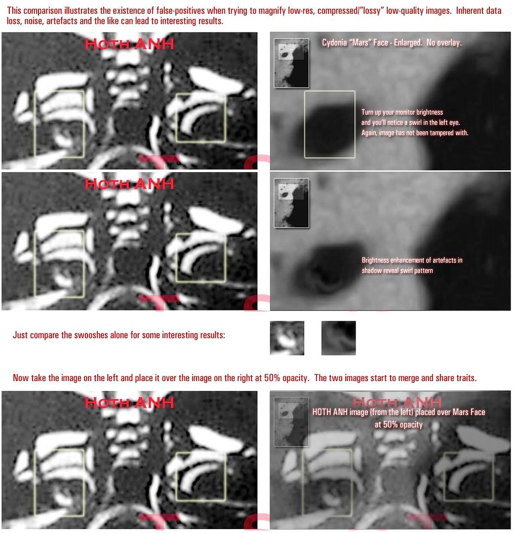
Let me take that Mars Face image that AP posted and do a comparison against the Hoth ANH, and show where using 50% opacity overlays can lead to false positives. This exercise actually yielded some very interesting results. Note that there is very little graphical information in AP's tiny image. Thanks to Photoshop filling in the gaps, as it were, this might help illustrate the point I was making.

Last edited:
ArtisanProps
Sr Member
Nice! I like the overlay. Pretty trippy stuff right there.. This is why photo's
should be CAREFULLY considered when offered as proof positive..
should be CAREFULLY considered when offered as proof positive..
You've asked me, time and again, to do things like this. With all due respect, if you're claiming "proof" then the burden of proof is on you. It's your job to disprove the false positives, not mine. You're the career scientist. We know of disproving false positives only from studying the principles of your profession.
The difference between the Mars face and what I am trying to show is that I already know it is a chin grill. :cool
It is just a matter of lining it up. There is no problem in terms of noise in those comparisons. The lens comparison is iffy and you really have to look at it for a while to see it but I think I can make something out barely there. Again, I put it up for people to judge for themselves. I'm not saying you have to accept it. But in combination with the other details I've looked at it seems to add up fairly well.
The issue about false positives relates to whether details on two images from different sources are the same and therefore represent the same mask. I would never think that just based on the neck details, for example, that it was a match, not by a long shot.
Anyway, here's another false positive for ya....:lol

Now keep in mind the neck would have been repainted at this point however, these white marks looks like scratches so it is possible that even with a light repaint the way the light reflects off the surface may still be picking that up underneath...that is just a supposition. But this was something that sort of jumped out at me anyway. Again I'm just showing my own research and you can take it as you like. It isn't proof. But as far as I am concerned, the grill comparisons are.
Let me take that Mars Face image that AP posted and do a comparison against the Hoth ANH, and show where using 50% opacity overlays can lead to false positives. This exercise actually yielded some very interesting results. Note that there is very little graphical information in AP's tiny image. Thanks to Photoshop filling in the gaps, as it were, this might help illustrate the point I was making.
Well I understand what you are trying to say but even in the enhanced versions I still see the scratch in the lens, plus I can tell the swooshes are very different.
Let's take your example and look at it more closely...

Look the same? Not to me...
Last edited:
Similar threads
- Replies
- 8
- Views
- 437
- Replies
- 25
- Views
- 4,228
- Replies
- 244
- Views
- 37,348
- Replies
- 15
- Views
- 3,769
- Replies
- 35
- Views
- 9,241


