Escape Pod (original design)

Most of the outer surface detailing has now been done.
The black bits are 1mm styrene sheet.
There is still a few areas that may need a few bits added but I will spray a primer grey pass next to see where
it's at before deciding.
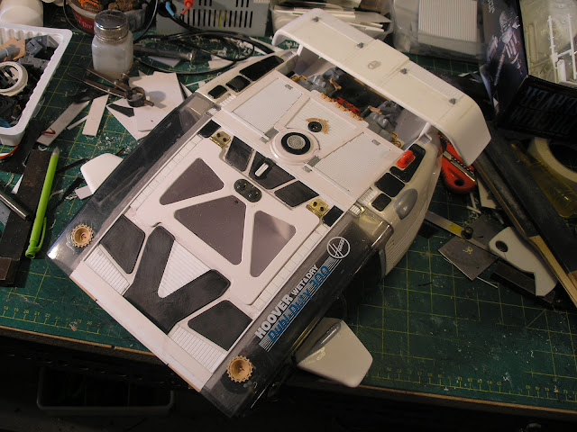

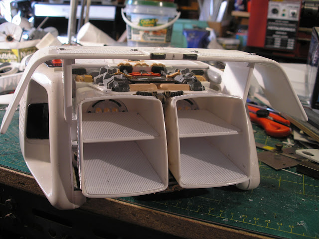


I also finished up the retaining system for both hatches.
The rear hatch has a plug that fills the hole for the support rod.
The hole for the support rod also acts as the handle to pull the hatch up and forward to release.
A couple of small round magnetic cabinet catches hold the hatch in place in each front corner.
The steel washers from the catches are superglued to the under side of the hatch. You first have to roughen
up the glued side with very coarse sandpaper so that the superglue can grip effectively, as well as allowing
some to squeeze up through the counter sunk screw hole.
A squirt of accelerator helps the super glue to harden quickly.


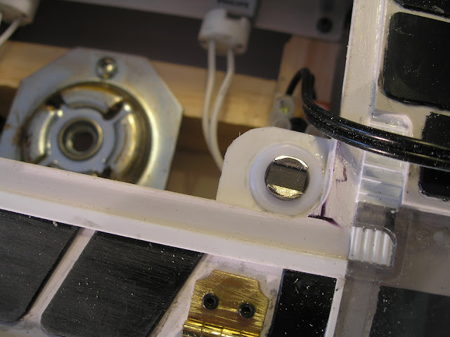


The rear of the hatch is gripped by a long strip of plastic that hooks under the hull opening.


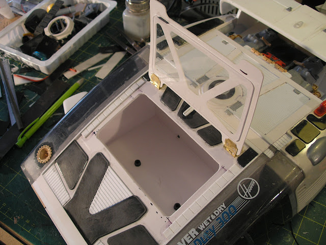
After stating here only a couple of posts ago I wasn't going to hinge the canopy hatch, I went out and purchased
a couple of tiny hinges and... hinged the hatch.
The hinges are superglued to the hatch and to the hull again roughening up the glued surface, and in addition
with a couple of m2 cap screws screwed in as part of the detail.
The front is held in place just by the friction fit of the acrylic window into the hole in the hull.
Some more positive closure may be required, we will see.




Next up is masking the windows, a grey primer pass and then starting the cockpit interior.
More soon...
 
The escape pod is looking really good.

Hopefully this is not too presumptuous, but I have a suggestion regarding glueing brass to plastic - experience has taught me 2-part epoxy is more reliable than superglue.

Looking forward to more!
 
experience has taught me 2-part epoxy is more reliable than superglue.

Lamby you are absolutely correct, however this hatch will not be subject to many opening and closing cycles.
Iit will only be used once or twice so I figure the super glue in this circumstance should be adequate.

Primer is on.

It didn't take too long to dry as it was 36 degrees Celsius here in the south west of Western Australia today.
The primer overspray dried as it fell. Went around with a scotch brite pad to knock of all the furry bits of primer.

I decided to chip a couple of the black 1mm styrene panels off the top at the rear as I didn't like them.
I forgot to replace the hole plugs when I took the photos.


I am planning to scribe some panel lines into the plainer surfaces.


more soon...
 
Such a great build, love what you've done here, looking forward to seeing this complete :thumbsup
 
After a slight deviation into the Escape Pod Mk2 project I returned to completing the cockpit of this Escape Pod
project or Shuttle Pod as it has become.

I made up a seat assembly which is removable at the moment so that I can eventually get some paint into the interior.


I decided to light the internals of this cockpit with bright blue leds, 4 in total and with a forward drop of 3 volts
each all 4 could be wired in series and run on a 12 volt supply without a preliminary in series resistor.


I then made a console that fits over the light housing in much the same way as the Escape Pod Mk2 project
using sandpaper frosted acrylic sheet diffusers surfaced with 1mm black styrene fascias perforated with screens
and holes for lights.
In this instance, due to the blue leds, there was no point using any Tamiya clear colours to back the various switches
as they would only come out as darker shade of blue.
I thought the blue-lit interior might make an interesting complimentary colour contrast with the hull which I am
planning to paint yellow.
We'll see if this works out in practice.
The console has been nurnied using many tiny parts from a Trumpeter Stryker kit.
If you want lots of really tiny nurnies that's the kit for you.


Next up is scribing panel lines and paint.
More soon...
 
I've got to admit, when I saw the first few pics I thought to myself "A+ for creative materials, but this thing sure looks ugly..". Now I have to eat those words, because with the superb level of detailing, smooth sculpted surfaces and slick paint job, this ship looks ready to take off and fly; it is absolutely stunning :D

the only thing I would have commented for change is the plainer surfaces, but I see you're already planning on detailing those which I reckon will look great. If these are the kind of ships you're making out of dust busters, I'd love to see what you can make out of a vacuum cleaner some day! :lol
 
As it happens I went into a vacuum cleaner store yesterday and asked about discarded cleaners I might be able to scrounge, the owner is about to move shop and promised in a month or two I could look over his throw outs when he cleans up his store room and pick what I wanted.

As to ugly I agree with you, but its one of the things I like about adapting found objects, you get shapes and forms that you ordinarily wouldn't dream up but they sometimes have a peculiar aesthetic which can be captivating in a brutish utilitarian kind of way.
 
I completed scribing panel lines over the plainer areas of the surface and then finished up with spot putty
and more grey primer.

I was trying for a 1970's Science fiction book cover style and originally painted it yellow with some sections
black and what from the cap colour looked like red but was really a reddish orange.
Unfortunately the current fashion in automotive paints is more towards a lemon yellow rather than the warm
orangy yellow I was trying to find so I relented and sprayed the warmest yellow I could find but it really wasn't working.
I attempted to reduce the yellow down to stripes but it still looked like a dog's breakfast.
After much more tedious masking I eventually sprayed over all the remaining yellow with the left over orange
from the Toybash Truck project for the final result shown.
My usual technique of weathering was applied and paint chipped off the edges of the panels by scraping with a scalpel.
Some decals from kit part nurny donors was added.


Below is a close up of the photo-voltaic panels. These were sprayed a blue metallic colour and then with a tiny
brush different shades of a blue, metallic turquoise and a black permanent marker were employed to pick out
random squares.
The permanent marker shines in an interesting pearlescent manner when it catches the specular light.


I still want to add some markings on the side and I'm thinking of adding some landing pads underneath.
The pilots also need painting , however my holidays are over and its back to work on Monday so the pace of
progress will regrettably slow.

More soon...
 
WOW!!!! That build is truly remarkable!! You have done an incredible job, with all the detailing and I am loving the color scheme!!!
Can't wait to see your next progress pics...
 
I love the color choices, reminds me of something one might find in a a Gerry Anderson Production.
Added Detail.jpg
If I may be so bold, I added some detail in photoshop to breakup the still noticeable handle from the Dustbuster. Even some panel lines would help, please don't take offense.
 
Last edited:
Captain April I like your idea for improvement, its an area I had no solutions for, it was too hard to scribe around that curved surface with out the scriber deviating about all over the place but you are right it needs something there.
Thanks for taking the trouble to photoshop it.
I'll see what i can do.
 
First off, this is inspiring.

The other thing I want to mention here is that one of the great things about the old ilm star wars models is that they used everyday items as inspiration and for kit bashing.

Perhaps one of the reasons that there is so little of interest in the TFA designs is that they no longer use those parameters to inspire their creativity.

Sent from my SM-N910W8 using Tapatalk
 
I think the main reason there is not much interest in the TFA designs is that they are pretty mediocre designs. Star wars was full of iconic designs based on very simple geometric shapes. The Star destroyer was essentially a big pointy triangle, the Millennium Falcon a big circle with a couple of bits sticking out the front, the TIE fighter a sphere joined with a couple of vertically stretched hexagons. These simple underlying shapes really cut through even in silhouette. The modern CG/Concept art style is to drown in multiple shapes and surfaces all over the place, complexity because you can. I was thoroughly disappointed in the spaceship aspect of TFA. There were no iconic spaceship shots, the new spaceship designs were difficult to make out. The new star destroyer was mostly seen from a low 3/4 angle looking slightly up, you never got a sense of the geometry of the thing, the silhouette didn't read at all. The transport ship was just a sort of black box, again you never got a sense of its shape. Only the old designs shone in the movie and I was hoping for some new inspiration... besides the fact that CG spaceships just don't hook me in the same way as miniatures continue to do.
 
Back
Top