The original was definitely woven, but we'd have to make thousands to do a reweave, so we'll probably just have to print onto the wool. We're working on it...
-
Welcome to the Project Runs Forum!
This forum is intended for interest gauging and active runs. Due to the transient nature of this forum, please keep all research and ongoing discussion in one of our main forums so your information is not lost.
Only Premium Members can start a new run.
You are using an out of date browser. It may not display this or other websites correctly.
You should upgrade or use an alternative browser.
You should upgrade or use an alternative browser.
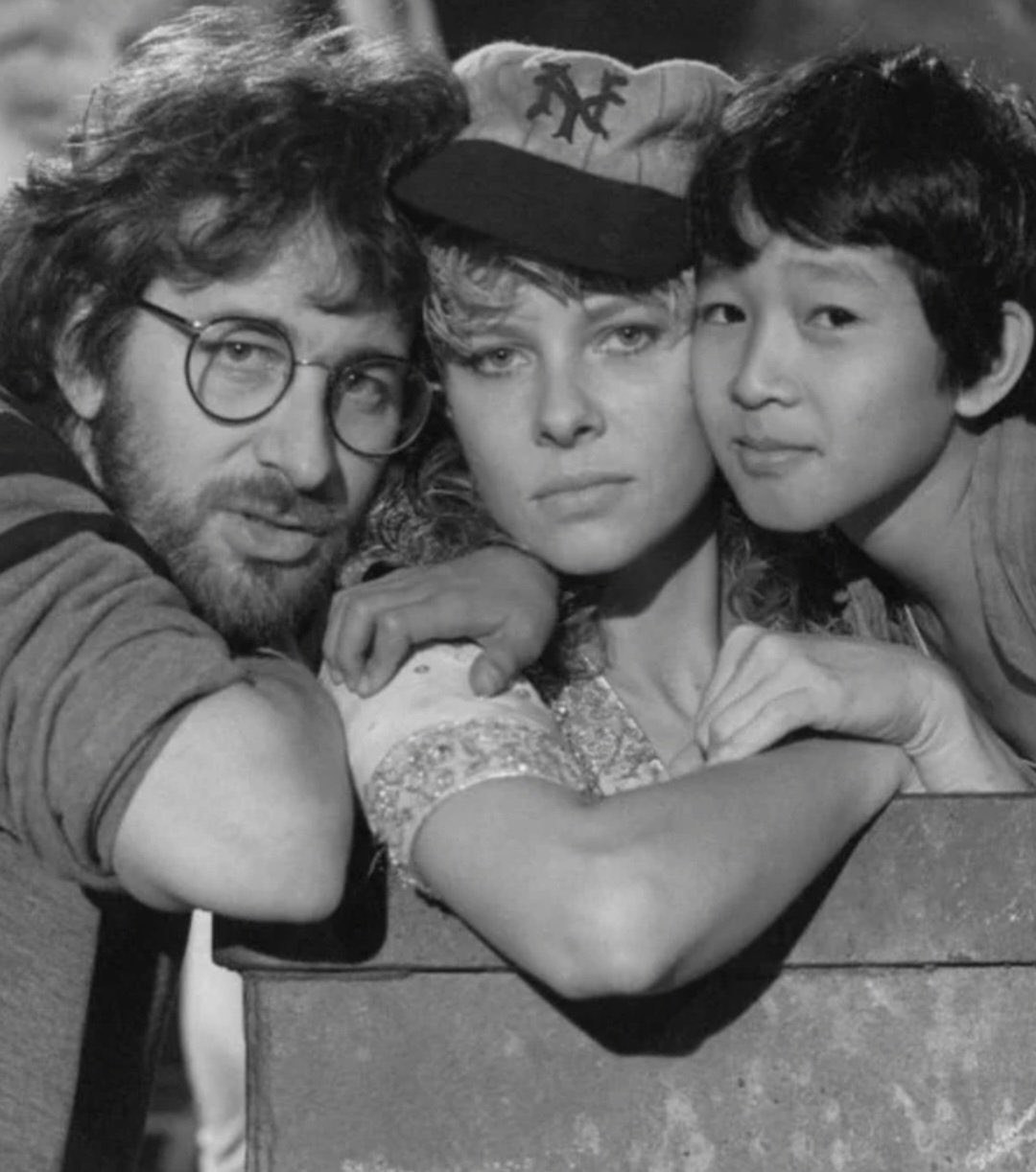
Limited Run Short Round's Baseball Cap by Magnoli Clothiers
- Thread starter Indy Magnoli
- Start date
I’m sure that weaving would be a different proposition altogether. For my own edification, is there an easy way to tell that the stripes were woven?The original was definitely woven, but we'd have to make thousands to do a reweave, so we'll probably just have to print onto the wool. We're working on it...
I've got a picture of the original fabric swatch which is clearly a block-stripe woven into the material.
Ah. Ok. Thx. I personally don’t think it’s something that you can tell from watching the prop in the film but others may disagreeI've got a picture of the original fabric swatch which is clearly a block-stripe woven into the material.
Definitely. You won't be able to tell unless you're holding it in your hands and looking really closely.
Interested
Lol mercilessDoes this mean a sample is coming soon
Damn straightLol merciless
We want to keep people interested and excited, so it gets a run
Working on it. 
Looks great on anybody.

Working on a sample right now!
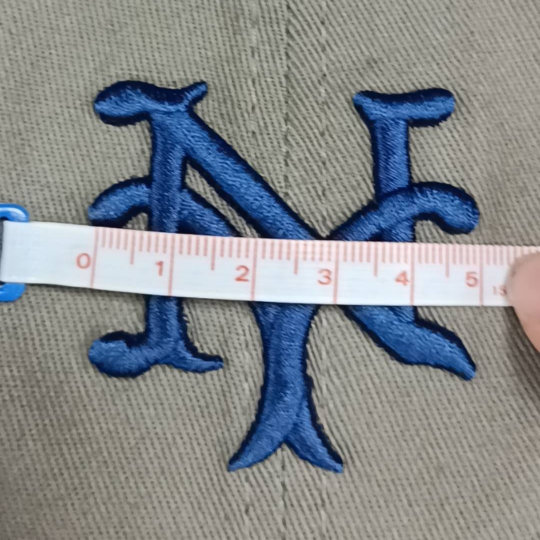
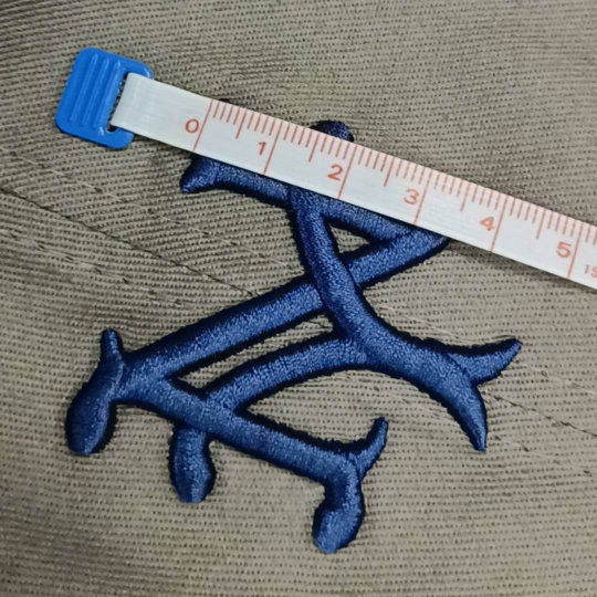
First embroidery test:


Cool. The blue looks a little light (like Carolina blue). The screen version seems to me to be a dark navy. But that may just be the lighting and the pic. As far as size, I’ll check the size of the logo on my hat (which is too small) for comparison when I get home.
Finally, one question I would pose to you/the group would be…. Are we trying to replicate the logo as it appears on short round’s hat or the official NY Giants logo. If it’s the latter, then I think you’ve pretty much nailed it.
However, the logo on SR’s hat in the film is a bit different from the official one in a couple of respects. For example, unlike the official team logo, the left prong of the Y is a lot closer (almost on top of) the N. See the pics below. Also, the two prongs of the Y do not appear to be symmetrical in the screen prop. The left prong of the Y appears to extend further up and closer to the N before curving down.
So I guess it’s a question of what people want. Personally I’d like to track the screen prop as closely as possible even if it varies from the official logo but, of course, it’s also a question of what’s feasible.
Color is not the final color (this is just a mock-up to test the embroidery). If you guys want to revise the actual logo, we need to do it RIGHT NOW. So any other tweaks, let us know ASAP. I think I'd like to change the at least one of the serif tails as well.
Similar threads
- Replies
- 18
- Views
- 913
- Replies
- 46
- Views
- 3,627
- Replies
- 12
- Views
- 1,374
- Replies
- 3
- Views
- 411
- Replies
- 31
- Views
- 2,432
