Stranger things

I found the original map from the right year. It is scanned at high res and I am in the process of photoshopping/editing. Just have to fit it in my schedule.

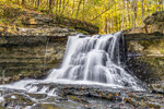
Would you happen to have any helpful info on this map? It looks like they tweaked the design of Bob's map (a fair amount, but it looks similar enough) and used it for Dustin's map in Season 4 or at least one very similar. I'm wondering if I could use your high-res scans as a base to go about redesigning to fit Dustin's - if it helps, I have already found the Waterfall photo on the front:

Stranger Things 0406 - Map_2.jpg
 
UPDATE: Nevermind. It appears the original user has not been online in about a year. So, I also managed to track down the map. It's on it's way. I'll have it scanned and begin working on both maps.

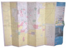
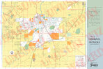
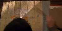
For reference, it's a modified vintage Standard Oil map of Fort Wayne. 1976 or 1977. Take a look at the flipped auction photo of the one I just bought:
s-l1600_crop.jpg

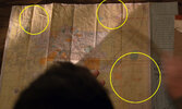
With this original for reference, you can to tell where the major modifications are as there are a couple harsh cut offs that match with the grid lines and, in some areas, entire panels. See the circled areas below, notice how some of the roads and rivers just stop abruptly, there's even an entire rectangle outline that borders a modified panel on the lower right:

Map Mods_crop.jpg

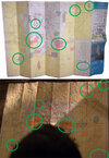
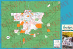
And here's highlights of the noticeable similarities:
Map Comparison.jpg

Same border, same base yellow color, etc, but with added lakes, various modifications to the top section and a bit on the far right lower panel and of course color shifting the pink to a bright orange, etc, etc. Plus, there appears to be some shifting around going on in the middle left area too (notice that the folds don't match in this quadrant vs matching in other areas.

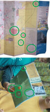
And again, I believe this same map is the base for Dustin's Season 4 map. Actually, the modified Bob's map is the base, as the same modifications carry over with significant color alterations and a new front and back:
dustin map comparison.jpg

Of course, I suppose there's a chance that Dustin's is Standard Oil, but a different year than the above map. I wouldn't be surprised though if it's just heavily altered by the graphics team.

I mentioned the Waterfall photo by the way. Here it is over at Adobe stock:
1000_F_140940976_qVEXjCPrMQylaEqrqpNsR6t3NxybrWyY.jpg

Anyone recognize the font for the Hawkins heading on Dustin's? Bob's front cover uses Testament III Regular as the main header.

Finally some progress!
 
Last edited:
UPDATE: Nevermind. It appears the original user has not been online in about a year. So, I also managed to track down the map. It's on it's way. I'll have it scanned and begin working on both maps.

For reference, it's a modified vintage Standard Oil map of Fort Wayne. 1976 or 1977. Take a look at the flipped auction photo of the one I just bought:
View attachment 1655743

With this original for reference, you can to tell where the major modifications are as there are a couple harsh cut offs that match with the grid lines and, in some areas, entire panels. See the circled areas below, notice how some of the roads and rivers just stop abruptly, there's even an entire rectangle outline that borders a modified panel on the lower right:

View attachment 1655744

And here's highlights of the noticeable similarities:
View attachment 1655745

Same border, same base yellow color, etc, but with added lakes, various modifications to the top section and a bit on the far right lower panel and of course color shifting the pink to a bright orange, etc, etc. Plus, there appears to be some shifting around going on in the middle left area too (notice that the folds don't match in this quadrant vs matching in other areas.

And again, I believe this same map is the base for Dustin's Season 4 map. Actually, the modified Bob's map is the base, as the same modifications carry over with significant color alterations and a new front and back:
View attachment 1655746

Of course, I suppose there's a chance that Dustin's is Standard Oil, but a different year than the above map. I wouldn't be surprised though if it's just heavily altered by the graphics team.

I mentioned the Waterfall photo by the way. Here it is over at Adobe stock:
View attachment 1655747

Anyone recognize the font for the Hawkins heading on Dustin's? Bob's front cover uses Testament III Regular as the main header.

Finally some progress!
Wow! Outstanding work! And you found the waterfall stock image to go with it on top! I wonder why they decided to change the map cover from the one designed for Bob's map?
 
The font for the Hawkins heading on Dustin's map has been identified thanks to Scott over at the wonderful WhatTheFont forum.
It's LHF Scriptana - the images I submitted were not high quality enough for the automatic process, but the experts over there did their magic.
font_rend.png

This will be very helpful in finishing Dustin's map.
 
BrotherWilliam Preview on the progress of Bob's Map. I know this is the free paper props thread so don't worry, I will include the full-res-non-watermarked one soon. I just want to tweak a couple more things and do a master post that includes several other maps (Surprise!).

ST2 Bob's Map Preview.jpg
Comparison.jpg

It's not going to be 100% pixel perfect, but it's probably a good 95% of the way there. There's a lot of cloning involved to remove pieces of the map - I tried to get it as close as I could, but there are small areas that are just a little off - always will be when recreating something like this from scratch. Especially because I could not find a singular map that encompassed everything that was needed. Different years had different elements, so I'm sure one year had everything on one map, but I was unable to find that.

Perhaps the previous poster found one that checked off more of the boxes needed right out of the gate (it certainly seems to be the case based on what they said), so a lot of work went into compositing elements from two separate maps, from two separate years, but both produced by Standard Oil for Fort Wayne, IN. For example, one map that was most of the way there had little markers denoting gas stations on it. The other map didn't have these markers (which the prop is also missing) and also included the missing panel - however, a large majority of the colored areas were not included on this other map.

The biggest help though, was that the graphic artist who created the map for the show posted a great reference point for it on his site.
This was very helpful in determining colors, clearing up some of the unique text, and giving a better look at the cloning work.
To be clear though - no elements were used directly from the image on his site. It all had to be redone on my own with the original map scans.

Lastly, there does appear to be some kind of back to the map featured on the show, but there's not enough detail to make out in this quick shot. It doesn't match the back to the maps I have, but personally, I am content with just having the front.
BobMapBackRef.jpg

The original maps that this was scanned from are sized at 18" x 26.5" so this is the size I went with for my recreation.
Anyone have any thoughts as to what kind of paper this should be printed on?
 
Last edited:
Progress on Dustin's iteration of Bob's Map. Still tweaking this - a lot of messing with colors, which will likely change a bit before the final (mainly the blue and green).

Having to take a lot more creative liberties on this one, as there is not really any good, clear reference for it. I'm going to have to find something I can do about the back cover. I know it's an orange box with a bunch of text, but that's about it. It looks like it might be some kind of bulleted list or maybe reference points on the map - so my only thought right now is to steal the reference list off of one of the maps I scanned for now.

I'm not too worried about it for my purposes, as I mainly plan to use it as an accessory to my Dustin backpack build.
So, it will likely live folded up in one of the pockets most of the time.

ST4 Dustin's Map Progress.jpg
Capture 16.jpg
Capture 17.jpgCapture 21.jpg
 
Little update. I'm doing a test print for Bob's Map before I post the final design. Just want to make sure I'm happy with it before I unleash it on you guys. Lol.

Did a test print for Dustin's and it didn't come out quite right so I'm back to tweaking it.

EDIT: The test prints for Bob's Map have shipped!
EDIT #2: Okay so it turns out they didn't actually ship until 3/16, but they're on track to arrive this week.

Since this process has taken longer than I expected, as long as these prints come out looking good, then I will post Bob's Map sometime this week!

Dustin's will follow once I'm sure I've fixed everything
 
Last edited:
Got the first test prints for Bob's Map! Doing some final tweaking, really need to up the contrast and saturation.
I am going to place one more order tomorrow with the (hopefully) final tweaks and then I'll post the final version of the design used for printing.

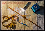
In the meantime, here's a little proof of concept using a prototype map print with my Bob prop collection!
untitled-1085_Edit_marked.jpg
I
 
Got antsy during the wait for the new maps...
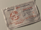
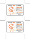
So, I put together another paper prop! The Surfer Boy Pizza coupon!
IMG_3925_small.jpg
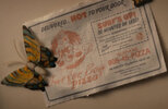
vlcsnap-2023-04-03-21h29m38s250.jpgvlcsnap-2023-04-03-21h44m27s438.jpg

I've estimated the size at 4.5" - however, I actually found the exact butterfly magnet, so I can more accurately discern that when it arrives.
EDIT: The width is actually closer to 5.25"

I printed this prototype on newsprint and tore it out of the page to have the frayed edges.
Would everyone like me to go ahead and post it, even though I am unsure of the exact dimensions? Proportionally it's all good.
 
Last edited:
Got antsy during the wait for the new maps...
So, I put together another paper prop! The Surfer Boy Pizza coupon!
View attachment 1687191
View attachment 1687192View attachment 1687193

I've estimated the size at 4.5" - however, I actually found the exact butterfly magnet, so I can more accurately discern that when it arrives.

I printed this prototype on newsprint and tore it out of the page to have the frayed edges.
Would everyone like me to go ahead and post it, even though I am unsure of the exact dimensions? Proportionally it's all good.
Hell's yeah! I can use that for my stranger things section
 
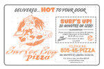
Here we go OasisSupernova ! Presenting the Surfer Boy Pizza Coupon from Stranger Things 4.

Below is an individual one and a quad layout with crop marks for printing on 8.5" x 11".
ST4_SurferBoyPizza_NewspaperCouponv3.jpgST4_SurferBoyPizza_NewspaperCouponv4_DuoPrintwCropLines.jpg

The colors are formatted and were decided on based on how the coupon printed by using my laser printer with newsprint paper, which was just
Pacon® Plain Newsprint, 8 1/2" x 11" available on Amazon.

To achieve the frayed / torn out edges, I just folded along the crop marks, made sure the folds were very sharp and flat by running a credit card along them, then folded back and forth like this over and over again until it felt like I'd be able to cleanly tear along the fold. After that, feel free to wrinkle it up a bit, adding wear and tear to your preference.

EDIT: Replaced the print page with the correct, more accurate size. See post on Page 4.
 
Last edited:

Your message may be considered spam for the following reasons:

If you wish to reply despite these issues, check the box below before replying.
Be aware that malicious compliance may result in more severe penalties.
Back
Top